
IB Business Toolkit Descriptive Statistics
Guide to the IB Business Toolkit. Learn Descriptive Statistics - A data tool used for supporting analysis and decision making. For IB Business students.
IB BUSINESS MANAGEMENTIB BUSINESS MANAGEMENT SLIB BUSINESS MANAGEMENT HLIB BUSINESS MANAGEMENT TOOLKIT
Lawrence Robert
5/27/202615 min read
Toolkit 7: Descriptive Statistics
Target question:
What is the meaning of Descriptive statistics in IB Business Management?
Let's imagine for a second that you're a manager at a mid-sized UK clothing retailer. You've just had your best Saturday on record - £42,000 in sales across five stores. You send the data to your board, and they reply with one word: "Context?"
Because a single number tells you pretty much nothing without the context. Was that 42k above or below your usual Saturday? Which store drove it? Was it a one-off spike or a trend? Are three of your stores consistently outperforming the other two, and if so, by how much?
This is why business managers need descriptive statistics - a toolkit of methods that takes raw data and transforms it into something you can actually use to carry out an analysis and take decisions.
Descriptive statistics:
Is a division of statistics that summarises and expresses data in usable ways to support analysis and decision making.
It covers three main areas:
Measures of average - mean, mode, and median
Graphical tools - bar charts, pie charts, and infographics
Measures of dispersion - quartiles and standard deviation
These statistical tools help managers identify patterns and trends in a data set that might not be immediately obvious from looking at the raw numbers. Let's work through each one - with real examples, worked calculations, and exam practice.
1. Mean
The mean (or arithmetic mean average) is the most common measure of average value in a data set. You already know this one from your secondary studies - it's the one you've been using since Year 7. Add everything up, divide by how many items there are.
It is calculated by adding up all the values in a data set and then dividing this total by the number of items in the set.
In business, the mean is used to express average figures across financial data, production output, and survey responses. It's also brilliant for making comparisons - for example, comparing the mean monthly sales revenue of different branches of a coffee chain to see which ones are underperforming.
Worked Example
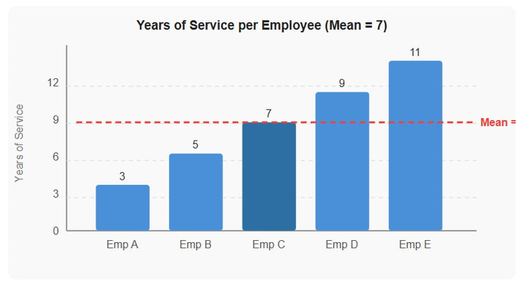
The following data show the number of years that each worker in a firm's sales department has been with the company: 3, 5, 7, 9, and 11.
Add up all the values: 3 + 5 + 7 + 9 + 11 = 35
Divide by the number of items (5): 35 ÷ 5 = 7
The mean length of service is 7 years.
Figure 1 - Years of service per employee. The red dashed line shows the mean value of 7 years.
Exam Practice Question
The average daily sales of a convenience store in a typical week are shown below.
Mon Tues Wed Thurs Fri Sat Sun
$3,500 $3,000 $4,500$ 5,000$ 8,000$ 8,600 $2,300
Calculate the mean value of sales for the convenience store. [2]
Model Answer
Add all values: $3,500 + $3,000 + $4,500 + $5,000 + $8,000 + $8,600 + $2,300 = $34,900 [1 mark]
Divide by the number of days (7): $34,900 ÷ 7 = $4,985.71 (to 2 d.p.) [1 mark]
The mean daily sales value is $4,985.71.
2. Mode
The mode is the value that appears most frequently in a data set. It's the statistical equivalent of asking: "What's the most popular option here?"
In business, the mode is particularly useful for identifying the most popular product in a firm's portfolio, the most frequent age group of a firm's customers, or even the most common category of customer complaint.
A business can use the mode to prioritise production and marketing efforts for its most popular product. Conversely, it might use the mode to consider discontinuing its least popular product lines.
One important limitation: it is possible to have more than one mode in a data set (a multimodal data set) or even no mode at all (a non-modal data set). This makes the mode less reliable than the mean or median in some situations.
Worked Example
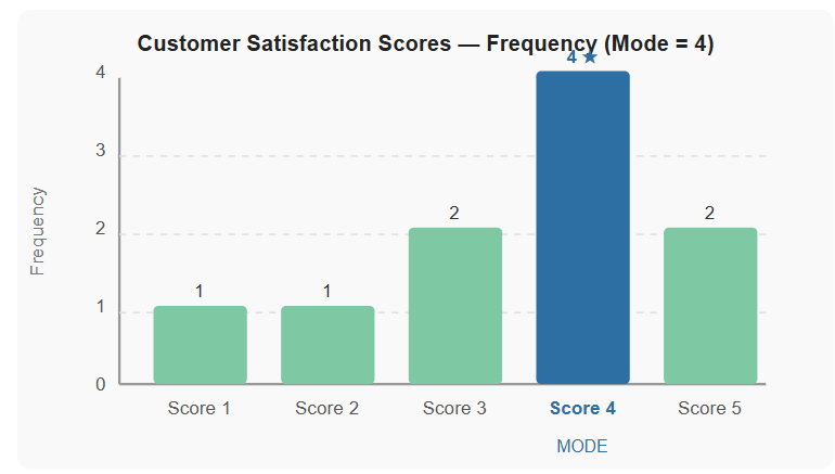
The data below show a customer satisfaction survey score (out of 5) collected from 10 customers at a hotel: 4, 3, 5, 4, 2, 4, 5, 3, 4, 1.
The score 4 appears four times - more than any other value. The mode is 4.
The hotel manager can use this to understand that the majority of customers rate their experience as "good" (4/5), but work remains to convert those ratings into excellent (5/5) responses.
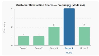
Figure 2 - Frequency distribution of customer satisfaction scores. Score 4 is the mode (appears most often).
Exam Practice Question
The data below show the number of toys sold by a retailer during the past month:
Product A Product B Product C Product D Product E
50 60 80 70 40
Describe the mode from the data above. [2]
Model Answer
There is no mode in this data set [1 mark] because each value appears only once - no product has the same sales figure as any other, so no value repeats [1 mark].
Note for students: This is a non-modal data set. Always check whether a data set actually has a mode before assuming one exists - this is a typical student error.
3. Median
The median is the middle value when the items in a data set are arranged in numerical order from lowest to highest. It is the value that sits in the exact centre of the ranked list.
The median is particularly useful when there are outliers (extreme values that differ from average values) in the data set, or when the data is skewed. In those cases, the mean gets dragged towards the extreme values and stops representing the typical experience - the median is far more honest.
The following is a typical real-world example: average salaries. In a company where the CEO earns £2 million and most employees earn £28,000, the mean salary might be £80,000 - which tells you almost nothing about what the typical worker actually earns. The median salary, on the other hand, gives a much truer picture.
If there is an even number of items in the data set, the median is calculated as the average of the two middle values.
Worked Example (Odd number of values)
A firm's sales revenue over five months: $12,000 / $15,000 / $13,000 / $16,000 / $14,000
Step 1 - Place in numerical order: $12,000 | $13,000 | $14,000 | $15,000 | $16,000
The middle value is $14,000. That is the median.
Worked Example (Even number of values)
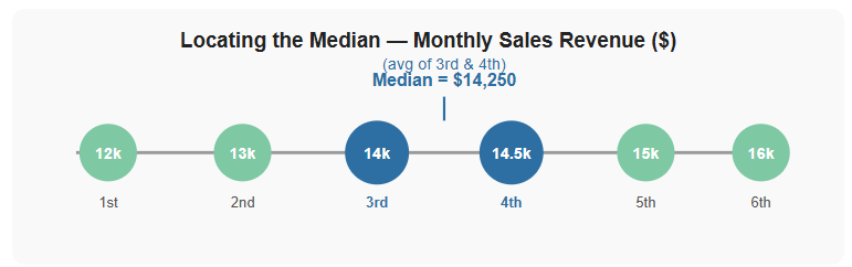
Adding a sixth month: $12,000 / $15,000 / $13,000 / $16,000 / $14,000 / $14,500
In numerical order: $12,000 | $13,000 | $14,000 | $14,500 | $15,000 | $16,000
Two middle values: $14,000 and $14,500 → Median = ($14,000 + $14,500) ÷ 2 = $14,250
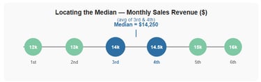
Figure 3 - The median sits between the two middle values in an even-numbered data set. Here, median = ($14,000 + $14,500) ÷ 2 = $14,250.
Exam Practice Question
A fashion retailer recorded the following weekly online sales figures (in £) over six weeks: £9,200 / £7,400 / £11,800 / £8,500 / £10,100 / £9,700
Calculate the median weekly sales figure. [2]
Model Answer
Step 1 - Place in numerical order: £7,400 | £8,500 | £9,200 | £9,700 | £10,100 | £11,800 [1 mark]
Step 2 - Two middle values (3rd and 4th): £9,200 and £9,700 → Median = (£9,200 + £9,700) ÷ 2 = £9,450 [1 mark]
4. Bar Charts
A bar chart:
Is a graphical representation of processed data in which the length (or height) of each bar shows the frequency or quantity of a different category.
The bars are typically positioned vertically or horizontally, with values displayed along the axes.
Bar charts are one of the most common and versatile tools in business management. They're usually excellent for comparing categories - comparing sales revenue across different products, tracking monthly performance over time, or visualising staff headcount across departments.
Bar charts have a key advantage over raw numbers: bar charts make patterns visible at a glance. A manager looking at a table of twelve revenue figures has to work hard to spot trends. A manager looking at a bar chart sees them immediately.
One practical note: when there are a large number of categories, bar charts are generally more suitable than pie charts, as too many segments on a pie chart become difficult to read.
Worked Example
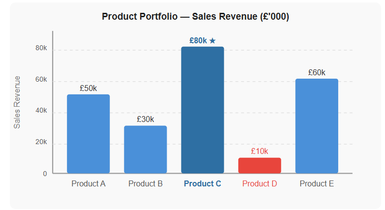
The bar chart below shows sales revenue for five products (A–E) in a firm's product portfolio. Management can instantly see that Product C is the best-seller (£80,000) and Product D is the weakest performer (£10,000) - information that directly informs production and marketing priorities.
Figure 4 - Bar chart showing sales revenue by product. Product C is the best-seller at £80,000; Product D is the weakest link at £10,000. Management can use this to prioritise resources accordingly.
Exam Practice Question
A regional bakery chain has four outlets. Their monthly revenue figures are as follows:
Outlet 1 - £18,000; Outlet 2 - £24,000; Outlet 3 - £12,000; Outlet 4 - £30,000.
Draw a bar chart to represent this data. Label all axes and give your chart a title. [4]
Model Answer
[1 mark] - Appropriate title (e.g. "Monthly Revenue by Bakery Outlet")
[1 mark] - Both axes correctly labelled (x-axis: Outlet name/number; y-axis: Revenue in £)
[1 mark] - Correct scale on the y-axis (0 to at least £30,000, evenly divided)
[1 mark] - All four bars drawn at the correct heights (£18k, £24k, £12k, £30k) with equal bar widths and clear gaps between them
Note: Bars must be drawn accurately to scale. The y-axis must start at zero.
5. Pie Charts
A pie chart:
Is a circular visual diagram that displays processed data as proportions or percentages that add up to 100% of the data set. Each segment is sized in proportion to the quantity it represents.
Pie charts are particularly effective in business management for displaying market share, sales revenue broken down by product or location, cost structures, customer demographics, or any other metric where relative proportion is the key insight.
The critical rule: all segments must add up to 100%. Pie charts work best when there are a limited number of categories - typically no more than six or seven. Beyond that, the segments become too small to interpret clearly, and a bar chart is a better choice.
To convert a percentage to degrees for drawing a pie chart: multiply the percentage by 3.6 (since 360° = 100%).
Worked Example
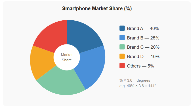
A smartphone manufacturer's market share data:
Brand A - 40%; Brand B - 25%; Brand C - 20%; Brand D - 10%; Others - 5%.
Figure 5 - Pie chart showing smartphone market share. Brand A dominates with 40% of the market. To draw each segment: multiply the percentage by 3.6 to get degrees.
Exam Practice Question
Use the following data from a school to create a pie chart representing the percentage of candidates who opt to write an Extended Essay based on each IB subject group. [4]
IB Subject Group / Percentage (%) / Degrees (× 3.6)
Group 1 20 72°
Group 2 10 36°
Group 3 45 162°
Group 4 15 54°
Group 5 5 18°
Group 6 5 18°
Model Answer
[1 mark] - Title included (e.g. "IB Extended Essay Choices by Subject Group")
[1 mark] - Each segment drawn to the correct proportion, based on the degree values shown above (total must = 360°). Group 3 is clearly the largest at 162°; Groups 5 and 6 are the smallest at 18° each.
[1 mark] - All six segments correctly labelled (Group 1–6) with percentage or degree values shown
[1 mark] - A key/legend is included, or segments are labelled directly on the chart
Note: Group 3 (Social Sciences) at 45% is by far the most popular EE choice. Groups 5 and 6 together account for only 10%. This could inform resource allocation for EE supervision.
6. Infographics
An infographic is a visual tool used to represent data by combining information (text) and graphics (images). The whole point of an infographic is to make complex data easier to interpret and understand for a wide audience.
As a form of descriptive statistics, infographics use visual tools to summarise and convey key insights about a specific topic or data set. They can incorporate charts, graphs, diagrams, timelines, flowcharts, maps, icons, and coloured illustrations - essentially anything that makes the data more engaging and accessible.
Infographics are particularly powerful in business contexts because they communicate to non-specialist audiences. A CEO presenting to shareholders, an HR manager briefing staff on diversity data, or a marketing team sharing campaign results - all of these scenarios benefit from infographics over raw tables or dense reports.
Compared to other graphical tools, infographics are more engaging and accessible as a form of communication to a wide audience. Their limitation is that they sacrifice some statistical precision in favour of clarity and visual appeal.
Worked Example
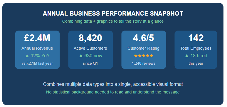
Figure 6 - Example infographic layout combining revenue, customers, satisfaction, and HR data into a single clear visual. The key advantage: any stakeholder can read it instantly, regardless of their statistical background.
Exam Practice Question
Explain two advantages of using an infographic over a data table to present annual sales results to a firm's shareholders at the AGM. [4]
Model Answer
Advantage 1: Infographics are more visually engaging and accessible [1 mark] - they combine text, icons, and graphics to communicate key findings quickly, allowing shareholders who are not financial specialists to understand the data without needing to interpret complex tables [1 mark].
Advantage 2: Infographics make trends and patterns easier to identify at a glance [1 mark] - for example, growth in sales revenue can be shown visually with an upward arrow or progress bar, which is far more immediately impactful than reading rows of figures in a table [1 mark].
7. Quartiles and the Interquartile Range
A quartile divides a data set into four equal parts, in the same way that the median divides data into two. Three quartile values are used:
Q1 (First quartile / 25th percentile) - the value below which 25% of the data falls
Q2 (Second quartile / 50th percentile) - the median; the middle value of the data set
Q3 (Third quartile / 75th percentile) - the value above which 25% of the data falls
The range is the simplest measure of spread: highest value minus lowest value. But it also has a critical flaw - it is heavily influenced by outliers (extreme values). One rogue data point can make the range look massive while 90% of the data is actually clustered closely together.
That's where the interquartile range (IQR) comes in. The IQR measures the spread of the middle 50% of the data, making it far more robust against outliers:
IQR = Q3 − Q1
In business, quartiles are used to compare the performance of different stores, sales staff, or product lines - ranking them and identifying which quarter of performers may need support.
Worked Example
Eleven employees take an aptitude test and scored out of 100: 33, 97, 37, 71, 13, 77, 84, 55, 57, 27, 94.
Place in numerical order: 13, 27, 33, 37, 55, 57, 71, 77, 84, 94, 97
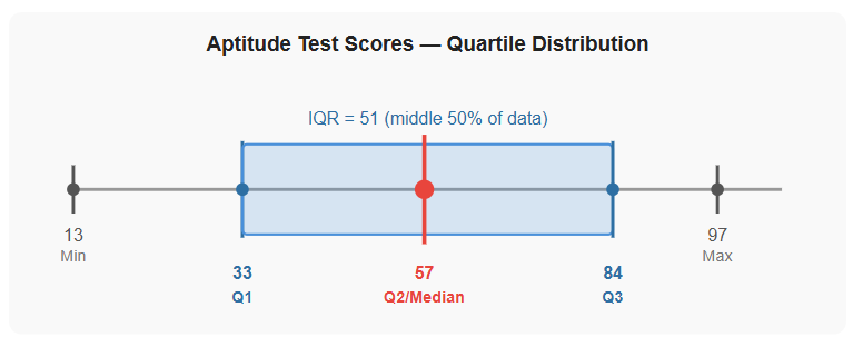
Median (Q2) = 57 (the 6th value)
Q1 = 33 (middle value of the lower half: 13, 27, 33, 37, 55)
Q3 = 84 (middle value of the upper half: 71, 77, 84, 94, 97)
IQR = 84 − 33 = 51
An IQR of 51 out of 100 indicates that the middle 50% of employees have results spread over a wide range - suggesting significant variation in staff aptitude and a potential need for targeted retraining, particularly for those in the bottom 25% (below Q1 = 33).
Figure 7 - Quartile distribution of aptitude test scores. Q1 = 33, Q2 (median) = 57, Q3 = 84. The IQR of 51 shows the middle 50% of scores are widely spread, suggesting uneven staff capability.
Exam Practice Question
The annual sales figures (in $'000) for nine sales representatives at a firm are: 42, 68, 35, 91, 55, 74, 28, 83, 60.
a) Calculate the interquartile range for this data. [3]
b) Briefly explain what this result tells the sales manager. [2]
Model Answer
Part a)
Step 1 - Arrange in order: 28, 35, 42, 55, 60, 68, 74, 83, 91 [1 mark]
Step 2 - Q2 (median) = 60 (5th value); Q1 = 42 (middle of lower half: 28, 35, 42, 55); Q3 = 74 (middle of upper half: 68, 74, 83, 91) [1 mark]
Step 3 - IQR = Q3 − Q1 = 74 − 42 = $32,000 [1 mark]
Part b)
The IQR of $32,000 indicates that the middle 50% of sales representatives achieve annual sales spread over a range of $32,000 [1 mark], suggesting considerable variation in individual performance - the manager may wish to investigate whether lower-performing reps (below Q1 = $42,000) require additional training or support [1 mark].
8. Standard Deviation
Standard deviation (σ) is a statistical measure of how spread out data points are within a data set. It shows whether results are clustered tightly around the mean or scattered widely.
A low standard deviation means data points are clustered closely around the mean - indicating consistency
A high standard deviation means data points are spread out over a wide range - indicating variability
Managers generally prefer a low standard deviation, because consistency is predictable and manageable. If your five stores all hit around £120,000 per month, you can plan confidently. If one hits £200,000 and another hits £40,000, your planning becomes a lot harder.
An important issue: standard deviation is sensitive to outliers. A single extreme value can significantly inflate the standard deviation even if the rest of the data is tightly clustered. This is why the interquartile range can be a useful complement to standard deviation.
How to Calculate Standard Deviation - Step by Step
Calculate the mean of the data set
For each data point, subtract the mean and square the result (squaring removes negative values)
Add all the squared differences together and divide by the number of data points (this gives the variance)
Take the square root of the variance → this is σ
Worked Example
Monthly sales revenue ($'000) for five retail outlets:
Store A = 120 / Store B = 110 / Store C = 130 / Store D = 125 / Store E = 115.
Step 1: Mean = (120 + 110 + 130 + 125 + 115) ÷ 5 = 600 ÷ 5 = 120
Step 2: Squared differences:
(120 − 120)² = 0² = 0
(110 − 120)² = (−10)² = 100
(130 − 120)² = (10)² = 100
(125 − 120)² = (5)² = 25
(115 − 120)² = (−5)² = 25
Step 3: Sum of squared differences = 0 + 100 + 100 + 25 + 25 = 250. Variance = 250 ÷ 5 = 50
Step 4: σ = √50 = 7.07
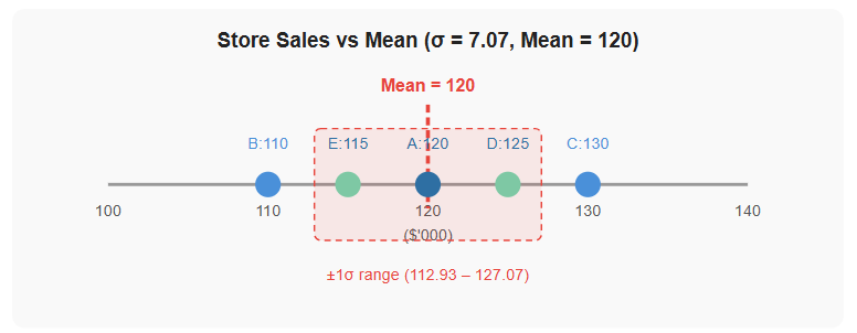
A standard deviation of $7,070 on a mean of $120,000 is relatively low - the stores are performing quite consistently. Management can be reasonably confident in their forecasts.
Figure 8 - Store sales plotted on a number line. All five stores fall within ±1 standard deviation (σ = 7.07) of the mean (120). The tight clustering indicates consistent performance across outlets.
Exam Practice Question
The data below show the sales of five employees at a retail store.
Employee A B C D E
Sales ($'000) 25 30 15 30 50
a) Describe what is meant by standard deviation in a data set. [2]
b) Use the data above to calculate the standard deviation. [4]
Model Answer
Part a)
Standard deviation is a statistical measure of how spread out data points are around the mean value in a data set [1 mark].
A low standard deviation indicates that data points are clustered closely around the mean (consistency), while a high standard deviation indicates that data points are widely spread (variability) [1 mark].
Part b)
Step 1 - Mean = (25 + 30 + 15 + 30 + 50) ÷ 5 = 150 ÷ 5 = 30 [1 mark]
Step 2 - Squared differences:
(25 − 30)² = (−5)² = 25
(30 − 30)² = (0)² = 0
(15 − 30)² = (−15)² = 225
(30 − 30)² = (0)² = 0
(50 − 30)² = (20)² = 400
Step 3 - Variance = (25 + 0 + 225 + 0 + 400) ÷ 5 = 650 ÷ 5 = 130 [1 mark]
Step 4 - σ = √130 = 11.40 (to 2 d.p.) [1 mark]
Examiner note: A standard deviation of $11,400 on a mean of $30,000 is relatively high (38% of the mean). Employee E ($50k) is a significant outlier pulling the standard deviation upward. The sales manager may wish to investigate why performance varies so widely and consider whether Employee C ($15k) requires support.
Find Support For Practicing Descriptive Statistics
The IB Business Management Activity and Case Study Book includes a full Module 6 section with case studies across all 15 tools - Swot Analysis, Ansoff Matrix, Steeple Analysis, Boston Consulting Group (BCG) Matrix, Business Plan, Decision Trees, Descriptive Statistics, Circular Business Models, Gantt Charts (HL only), Porter’s Generic Strategies (HL only), Hofstede’s cultural dimensions (HL only), Force Field Analysis (HL only), Critical Path Analysis (HL only), Contribution (HL only), Simple Linear Regression (HL only) (All with worked exam responses and marking schemes aligned to every assessment objective.)
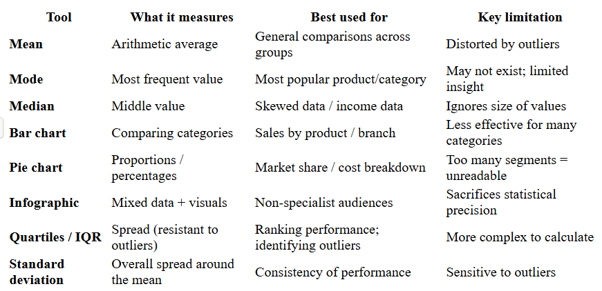
Quick Reference Summary
FAQ Block
Q1: What is descriptive statistics in IB Business Management?
Descriptive statistics is a branch of statistics that summarises and presents raw data in usable ways, using averages (mean, mode, median), graphical tools (bar charts, pie charts, infographics), and measures of dispersion (quartiles, standard deviation) to support business analysis and decision making.
Q2: What is the difference between mean, mode, and median?
The mean is the arithmetic average (sum of values ÷ number of items). The mode is the most frequently occurring value. The median is the middle value when data is ranked in order. The median is preferred when outliers are present because the mean is pulled towards extreme values.
Q3: What is the interquartile range and why is it used?
The interquartile range (IQR) is Q3 minus Q1. It measures the spread of the middle 50% of a data set and is preferred over the range because it is not distorted by extreme values (outliers).
Q4: What does standard deviation tell a manager?
Standard deviation measures how spread out data points are around the mean. A low standard deviation signals consistency; a high standard deviation signals variability. Managers generally prefer low standard deviation as it indicates more predictable, consistent performance.
Q5: When should a bar chart be used instead of a pie chart in IB Business Management?
A bar chart is better for comparing values across categories (e.g. sales revenue by product). A pie chart is better for showing proportions or percentages that sum to 100% (e.g. market share). When there are many categories, a bar chart is clearer.
Explore IB Business Management And Descriptive Statistics
IB Business Management Main Hub your daily IB Business Management resource
IB Business Management Descriptive statistics in the Business Management Toolkit
IB Business Management Paper 1 Exam Review Hub find Descriptive statistics exam questions in Paper 1
IB Business Management Paper 2 Exam Review Hub study Descriptive statistics exam questions in Paper 2
IB Business Management Paper 3 Exam Review Hub explore Descriptive statistics exam questions in Paper 3
IB Business Management Activity Book: Explore and practice The Business Management Toolkit including Descriptive statistics, Unit 1 Swot Analysis, Unit 2 Ansoff Matrix, Unit 3 Steeple Analysis, Unit 4 Boston Consulting Group (BCG) Matrix, Unit 5 Business Plan, Unit 6 Decision Trees, Unit 7 Descriptive Statistics, Unit 8 Circular Business Models, Unit 9 Gantt Charts (HL only), Unit 10 Porter’s Generic Strategies (HL only), Unit 11 Hofstede’s cultural dimensions (HL only), Unit 12 Force Field Analysis (HL only), Unit 13 Critical Path Analysis (HL only), Unit 14 Contribution (HL only), Unit 15 Simple Linear Regression (HL only) activities, exam questions, case studies, IB Standard model answers and IB marking schemes.
Read Next: IB Business Management Toolkit Circular Business Models
© Theibtrainer.com 2012-2026. All rights reserved.
Legal
Have a Tip? Send us a tip using our anonymous form