
IB Economics Paper 2 November 2024
IB Economics November 2024 Paper 2 Analysis. A comprehensive guide to IB Economics Paper 2 Learn about how you could answer this paper properly and why.
IB ECONOMICS SLIB ECONOMICS HL
Lawrence Robert
4/14/202628 min read


IB Economics November 2024 Paper 2 Topic by Topic
Target Question:
Is IB Economics Paper 2 the same for SL and HL?
This is my personal analysis of every topic area tested in the IB Economics November 2024 Paper 2 - what the examiner was in my opinion really looking for, the content you need to master, and step-by-step instructions on how to structure a high-scoring response.
Lawrence's note 1: I don't reproduce IB copyrighted exam papers or materials, as this would be unauthorised use, reproduction, distribution, or display of copyrighted material, and therefore, would violate the exclusive rights of the IB Institution. I just make a summary from a teacher's point of view, of everything you actually need to prepare in order to be successful at a paper 1 similar to this one.
Same paper, both levels: Unlike Paper 1, IB Economics Paper 2 is identical for SL and HL students. The 40-mark paper, the 1h45 time allowance, the two questions, the calculator - there is no difference. This information is widely misreported online. Both levels answer one question from a choice of two.
Lawrence's Note 2:
What follows is not a set of predicted questions or a likely topics list. This would not be realistic and be wary of websites and sources that sell "predicted questions" for IB Economics. This is a topic-by-topic breakdown of what the IB Economics Board actually tested in November 2024, for paper 2 written to help my students understand the depth of knowledge required in each area of the IB Economics paper, and teach them how to approach this particular paper and papers similar to this one.
Unlike other exam boards, the IB rarely / never rewards memory reproduction / memorising alone.
Every topic here was examined in a way that required genuine economic reasoning, and that is what this page prepares you for IB Economics Evaluation + reasoning + Critical thinking.
IB Economics Paper 2 Quick Reference
Time 1h 45 min
Marks 40
Questions Answer 1 of 2
Calculator Yes
Definitions 2 × 2 marks
Calc/sketch 2–3 mark parts
Explain parts 4 × 4 marks
Essay 15 marks
SL vs HL Same paper
How Paper 2 Works
Paper 2 is the data-response paper. You are given two substantial case studies - each built around three to five extracts and supporting statistical tables - and you answer one question in full. The question has seven parts: two definitions, a cluster of calculations and diagram sketches, four structured explanation questions each requiring a diagram, and a 15-mark extended response.
Question Description
Part (a) is two definitions at 2 marks each - easy marks if you know your terminology.
Part (b) is a numerical calculation worth 2–3 marks plus a diagram sketch.
Parts (c) through (f) each ask you to use a specific diagram and explain something from the case study - 4 marks each.
Part (g) is the 15-mark essay where you integrate economic theory, diagrams, and references to the text.
Suggested Time Allocation
Definitions (a): 6 minutes | Calculations/sketches (b): 8 minutes | Explain parts (c–f): 10 minutes each = 40 minutes | Essay (g): 45 minutes including planning. The 15-mark essay is worth 37.5% of the question - give it the time it deserves.
November 2024 Which Question to Choose?
In November 2024, Question 1 was built around the India-UK Free Trade Agreement, bringing in international trade, balance of payments, externalities, and sustainable development. Question 2 focused on the Malaysian economy, covering fiscal policy, subsidies, exchange rates, income inequality, and market intervention.
Before committing, skim all seven sub-question topics for both questions. Then ask yourself: which question's (g) topic can I write more balanced analysis on? The 15-mark essay has to be the key decision factor, because 15 marks out of 40 is the single biggest determinant of your score. A student who is marginally stronger on the earlier parts of Q2 but significantly stronger on Q1's SDG essay should choose Q1.
A word of advice, Students often choose a question based on recognising the case study country or topic, then discover mid-exam that the diagram required in one of the 4-mark parts is outside their comfort zone. Always check the diagram type for every part (c) through (f) before committing. In November 2024, Q1 required an international trade diagram, an externalities diagram, and an AD/AS diagram showing LRAS. Q2 required an AD/AS with a recessionary gap, a subsidy diagram, an exchange rate diagram, and a Lorenz curve.
Question 1 India–UK Free Trade Agreement
Topics: International trade - Balance of payments - Externalities - Sustainable development goals [40 marks available]
The India-UK case study explored the proposed free trade agreement between two countries at very different stages of development: India, a fast-growing emerging economy targeting 7% annual growth with aspirations to become the world's third-largest economy by 2030; and the UK, an advanced economy seeking closer trade ties with Asia's high-growth markets. The case study included inflation, balance of payments, intellectual property, infant industries, privatisation, labour rights, environmental costs, and sustainable development goals - a deliberately broad canvas for the extended response.
Question 1A - Definitions
(a)(i)Monetary policy [2 marks]
The context here is India's central bank tightening monetary policy in response to inflation rising from 4% to 7.8% between 2021 and 2022. The question tests whether you can provide a precise definition, not just a vague one.
1 mark (vague): Stating that monetary policy changes the money supply or interest rates, OR that it changes aggregate demand, OR that it aims to achieve macroeconomic objectives.
2 marks (accurate): Explaining that monetary policy involves changing the money supply and/or interest rates in order to change aggregate demand OR achieve macroeconomic objectives (low inflation, economic growth, low unemployment, exchange rate stability, healthy balance of payments).
Hundreds of students write "monetary policy is when the central bank changes interest rates." That gets 1 mark - maybe. The second mark is always for connecting the instrument to the purpose. The instrument (interest rates / money supply) must be linked to the outcome (changing AD or achieving a macroeconomic objective). No link, no second mark.
2-mark model answer
Monetary policy refers to the use of interest rates and/or changes in the money supply by a central bank to influence aggregate demand and achieve macroeconomic objectives such as low inflation, economic growth, and full employment.
(a)(ii)Current account deficit [2 marks] The case study references India's "large current account deficit" that has grown as worker remittances have fallen. This definition requires more precision than most students give it.
1 mark (vague): The idea that exports are less than imports (net exports are negative), or that inflows of funds are less than outflows.
2 marks (accurate): Understanding that a current account deficit occurs when the sum of net exports of goods and services, plus net income from abroad, plus net current transfers is negative.
The "exports minus imports" mistake
The most common error at 2-mark level: defining the current account as purely the trade in goods balance. The current account also includes trade in services, income (wages, dividends, interest), and current transfers (foreign aid, remittances). In this case study, falling worker remittances were specifically mentioned as worsening India's current account - remittances are a current transfer. Defining the current account as just "imports and exports of goods" loses the second mark every time.
2-mark model answer
A current account deficit occurs when the value of a country's imports of goods and services, combined with net income payments abroad and net current transfers, exceeds the value of its corresponding inflows - resulting in a negative balance on the current account of the balance of payments.
Master These topics at the IB Trainer:
IB Economics Monetary Policy Hub Page
IB Economics Balance of Payments Page for current account deficit
Question 1(b) - Calculation & Diagram
(b)(i)Percentage change in real GDP per capita, 2017–2021 [3 marks]
The data provided: Real GDP was $2.43 trillion in 2017 and $2.73 trillion in 2021. Population was 1.35 billion in 2017 and 1.41 billion in 2021. Three marks means three distinct steps - the examiner wants to see the working, not just the final answer.
Full worked solution
Step 1: GDP per capita 2017 = $2,430,000m ÷ 1,350m = $1,800.00
Step 2: GDP per capita 2021 = $2,730,000m ÷ 1,410m = $1,936.17
Step 3: % change = (1,936.17 − 1,800) ÷ 1,800 × 100
= 7.56% or 7.57% (both accepted - rounding at step 2 produces slight variation)
Exam technique
Each of the three steps earns one mark - so never skip to the answer. The "own figure rule" (OFR) applies: if you make an arithmetic error at step 2 but correctly apply the percentage change formula to your wrong number, you can still earn the final mark. Show the formula and all intermediate values.
Common errors
Forgetting to divide by population at all (calculating percentage change in total GDP, not per capita) - scores 0. Dividing by the wrong population figure. Not showing working. Giving the answer to more than two decimal places when the instruction specifies two.
(b)(ii)AD/AS diagram: tighter monetary policy impact on India's inflation rate [2 marks]
A sketch question - this rewards correct labelling and the right directional shift. Tighter monetary policy means higher interest rates, which reduces consumption and investment, causing AD to shift left, and the price level to fall.
Diagram requirements
Axes: Vertical = Price Level (or Average/General Price Level). Horizontal = Real GDP (or Real Output / Real Y - abbreviations accepted).
Curves: One AS curve (SRAS labelled as such, or Keynesian AS accepted). Two AD curves labelled AD₁ and AD₂, with AD₂ to the left of AD₁.
Price levels: PL₁ (original, higher) and PL₂ (new, lower) shown with dotted lines from the intersection points to the price axis.
Key movement: AD shifts LEFT → price level FALLS. This shows tighter monetary policy reduces inflationary pressure.
1 mark: Correct shift direction shown but missing or incorrect labels. 2 marks: Fully labelled, correct shift, price level change clearly marked.
A note on Keynesian AS
The mark scheme explicitly accepts a Keynesian AS diagram (L-shaped). If India's economy is operating in the upward-sloping section of the Keynesian AS, a leftward shift of AD still reduces the price level - same logic applies. Use whichever AS model you're most comfortable drawing correctly.
Master These topics at the IB Trainer:
IB Economics Measuring the Economy GDP Page
IB Economics Monetary Policy Hub Page
IB Economics Keynesian theory Page
Question 1(c) - Balance of Payments Interdependence
(c)Interdependence between the accounts of India's balance of payments [4 marks]
This is a "using information from the text and table" question, meaning text/data references are essential - without them, the maximum you can score is 2 marks regardless of how well you explain the theory. The mark scheme is looking for two strong points each anchored with evidence from the case study.
What the mark scheme credited
Core principle: The balance of payments always sums to zero. When added together, the current account, capital account, financial account, and statistical discrepancy (errors and omissions) equal zero. A deficit on one account must be matched by a surplus elsewhere.
Text-linked examples:
India's current account deficit (confirmed in Table 4: -$30.14bn in 2017, -$33.42bn in 2021) must be financed by a surplus on the capital/financial account.
FDI inflows (found in the financial account) are expected to increase as a result of the FTA - these inflows help finance the current account deficit. (Text A, paragraph 3)
Increases in portfolio investment outflows will later generate income inflows (dividends, interest) back onto the current account. (Text A, paragraph 3)
How to structure the 4-mark response
You need two well-made points, each supported by a text or table reference:
Point 1 - the fundamental principle: State that the BOP always sums to zero (current + capital + financial accounts must balance). Link to India's data: Table 4 shows a growing current account deficit, which must be financed by inflows on the financial account.
Point 2 - a specific linkage: FDI inflows into India (through the financial account) are expected to increase under the FTA (Text A, paragraph 3) - these provide the financial account surplus that funds the current account shortfall.
Optional third point for robustness: Portfolio investment outflows (financial account outflows) will eventually generate income flows (dividends, interest) back into the current account, illustrating how financial account transactions affect future current account balances.
Most common errors:
Writing a general textbook explanation of the balance of payments without using any data from Table 4 or referencing the India–UK case study. The mark scheme cap applies: without text/data, maximum 2 marks for this question. Always anchor your explanation to the numbers and paragraphs provided.
Master These topics at the IB Trainer:
IB Economics Balance of Payments Page
IB Economics Balance of Payments HL Page
IB Economics Balance of Payments Accounts Page
Question 1(d) - International Trade Diagram
(d)Lowering tariffs on British wine - impact on UK wine producer revenue [4 marks]
Note the subtle change of direction in this question: you draw an international trade diagram for India (the importing country) but explain the impact on UK wine producer revenue. This caught many students who explained the impact on Indian consumers or Indian producers instead.
Diagram requirements
Axes: Price on vertical axis (P is sufficient), Quantity on horizontal axis (Q is sufficient).
Curves: India's domestic supply (S) and domestic demand (D) for wine - S is upward sloping, D is downward sloping, crossing at the domestic equilibrium price.
World price lines: Two horizontal lines:
Pw + Tariff: the original (higher) world price with tariff applied
Pw (or PUK): the lower world price after tariff reduction
Quantities: At Pw + Tariff: India produces Q₁ domestically and demands up to Q₂; imports = Q₁ to Q₂. After tariff reduction to Pw: India produces Q₃ (less) and demands up to Q₄ (more); imports expand from Q₃ to Q₄.
Key point: The double-headed arrow showing the expansion of imports from (Q₁–Q₂) to (Q₃–Q₄) represents the increase in UK wine exported to India.
What the mark scheme credited for UK revenue
Removing or reducing the tariff lowers the price in India from Pw+Tariff to Pw. At this lower price, Indian demand for imported (UK) wine increases significantly. UK wine producers now sell a greater quantity at the world price Pw. Revenue for UK producers = Pw × Q exported, and since Q exported rises substantially, total UK wine producer revenue increases.
A complete answer explains both the price mechanism (lower price drives more demand) and the volume effect (UK exports more) leading to higher UK producer revenue. Just stating "revenue increases" without explaining why earns partial credit only.
The most common diagram error
Drawing the world price lines above the domestic equilibrium price. For a country that imposes tariffs to protect domestic producers, the world price must be below the domestic equilibrium - that's precisely why tariff protection is needed. If Pw is above the domestic price, India would be exporting wine, not importing it.
Question 1(e) - Externalities Diagram
(e)Market failure in the fossil fuel energy market [4 marks]
The case study explicitly identifies fossil fuel energy as creating negative externalities - carbon emissions, air pollution, and climate change costs that are not paid for by producers or consumers. This is a classic negative production externality diagram.
Diagram requirements - negative production externality
Axes: Price (or Costs/Benefits) on vertical axis; Quantity on horizontal axis. P and Q are sufficient.
Curves required:
MPC (Marginal Private Cost) = the supply curve, upward sloping
MSC (Marginal Social Cost) = above MPC, shifted up by the external cost at every quantity level
(MPB =) MSB (Marginal Social Benefit = Marginal Private Benefit) = the demand curve, downward sloping
Critical labelling on x-axis: QSO (socially optimum output - where MSC = MSB) to the LEFT of QM (market equilibrium - where MPC = MPB). Using generic Q₁ and Q₂ is not sufficient unless your written explanation explicitly names which is the market equilibrium and which is the social optimum.
Welfare loss: The triangular area between MSC and MSB, from QSO to QM. This should be shaded or clearly identified.
What the mark scheme credited in the explanation
The explanation must state at least one of: (1) the market over allocates resources to fossil fuel energy - too much is produced relative to what is socially optimal; (2) the fossil fuel market operates at a level that is not socially efficient (MSC > MSB at the market equilibrium); (3) a welfare loss to society exists because the external costs of production (carbon emissions, pollution) are not captured in market prices.
Negative externality of consumption - also accepted
The mark scheme notes that a negative externality of consumption approach also earns full marks if the explanation is correct. In this approach, the MPB curve sits above the MSB curve (consumption creates costs others bear - e.g., health costs from burning fossil fuels). The market produces more than the social optimum because consumers don't pay the full social cost of their energy use. Either approach works - but be consistent between diagram and explanation.
Mark cap for incorrect labelling
The mark scheme explicitly states: candidates who incorrectly label diagrams can be awarded a maximum of 3 marks. Always check: are MPC, MSC, MSB/MPB labelled? Are QSO and QM (or equivalent labels explained in text) on the x-axis?
Question 1(f) - Potential Output & LRAS
(f)Increased female labour participation and India's potential output [4 marks]
The data context here is quite radical: India's female labour force participation rate was just 23% in 2021 - roughly half the world average of 46.2%. Even a modest improvement in this rate adds millions of workers to the labour force, expanding the economy's productive capacity. The diagram needs to show this supply-side effect on potential output.
Diagram requirements
Axes: Price Level (vertical), Real GDP or Real Output (horizontal).
Curves: A LRAS curve (vertical) shifting rightward from LRAS₁ to LRAS₂. You may include a SRAS curve, but it is not required - the key movement is the LRAS shift. A Keynesian AS diagram (showing the full employment output increasing) is also fully accepted.
Quantities: Y₁ (original potential output) and Y₂ (new, higher potential output) marked on the horizontal axis at the base of each LRAS curve.
The shift: LRAS moves RIGHT because the quantity of labour (a factor of production) has increased. More workers → greater productive capacity → higher potential output.
What the mark scheme credited in the explanation
Increasing female labour force participation increases the quantity of labour - a factor of production. This increases the productive capacity or productive efficiency of the economy, shifting the LRAS (or Keynesian full employment output) to the right and increasing potential output from Y₁ to Y₂. The explanation must connect the labour increase to the capacity increase to the diagram shift - any missing link reduces the mark.
Use the data
At only 23% (against a world average of 46.2%), India has enormous untapped labour potential. Mentioning this context in your explanation - even with just one sentence - demonstrates that you are engaging with the case study rather than writing a generic textbook answer. Examiners reward this.
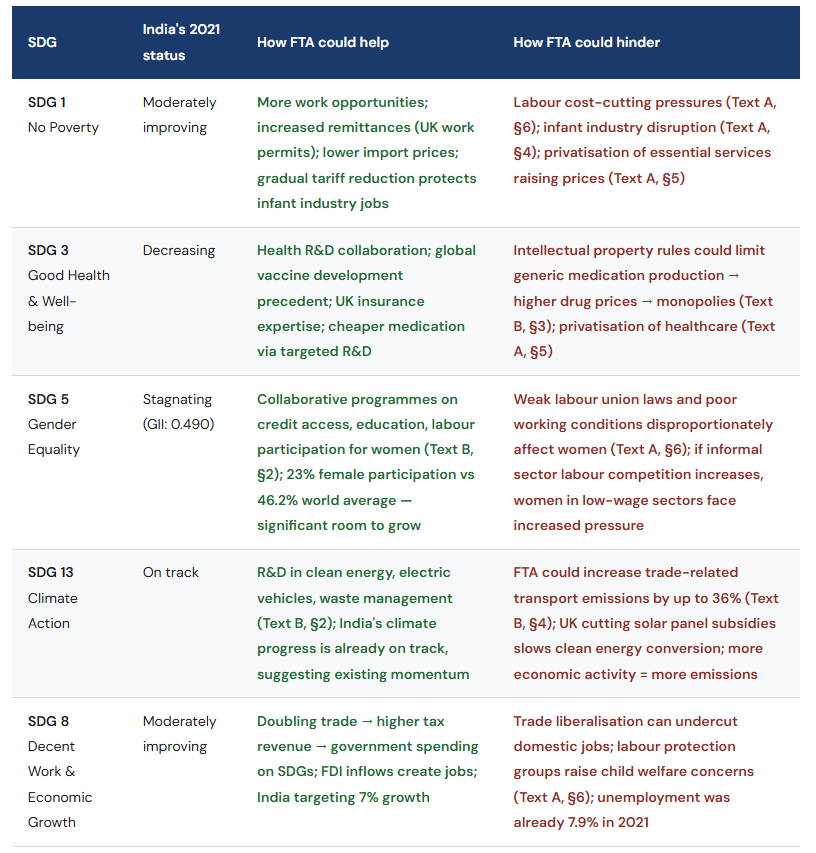
Question 1(g) - 15-mark Essay: India-UK FTA and India's SDGs
(g)Discuss the impact the India-UK trade agreement may have on India's ability to achieve two sustainable development goals [15 marks]
This is a "discuss" question - the command term requires a balanced review including arguments both for and against, supported by evidence. You must engage with two specific SDGs, not SDGs in general. The case study gives you direct SDG data in Table 3 showing India's progress on each goal, which is primary evidence you must use.
Which SDGs to choose?
You can select any SDGs, not only those in Table 3. However, Table 3 is a gift - it shows India's progress on ten goals, several of which are directly addressed in the case study. The most suitable combinations are:
SDG 3 (Good Health and Well-being) + SDG 5 (Gender Equality) - both stagnating or decreasing; excellent text support from Text B
SDG 8 (Decent Work and Economic Growth) + SDG 13 (Climate Action) - trade-off between growth and emissions is explicitly in Text B
SDG 1 (No Poverty) + SDG 2 (Zero Hunger) - both connected to trade, infant industries, labour rights
Avoid choosing two goals where you can only make arguments in one direction. The "discuss" command requires balance.
Mark band descriptors
13–15 Thorough understanding. Fully explained theory. Relevant diagrams included and fully explained. Effective and balanced synthesis/evaluation. Text/data integrated to support reasoned argument.
10–12 Specific demands understood and addressed. Theory explained. Diagrams included and explained. Mostly balanced evaluation. Text/data generally appropriate and correctly applied.
7–9 Understanding present but demands only partially addressed. Theory partly explained. Some relevant diagrams. Evaluation present but lacks balance. Some text/data used.
4–6 Some understanding. Relevant theory described rather than explained. Superficial evaluation. Limited text/data use.
1–3 Little understanding. Theory stated but not relevant. No synthesis or evaluation. No meaningful text/data use.
Response structure for a top-band answer
Introduction: Define the FTA context briefly. State which two SDGs you will discuss and why they are relevant to the case study. Note India's overall SDG ranking (121st out of 163 countries, Table 2) to establish the baseline.
SDG 1 analysis (or your first goal): Explain how the FTA could help (e.g., increased export revenues → higher incomes, more jobs → poverty reduction) and hinder (e.g., infant industry disruption, labour cost-cutting pressures, privatisation of essential services increasing prices). Use specific data and paragraphs.
SDG 2 or 3 or 5 analysis (your second goal): Repeat the structure - both supporting and undermining arguments with evidence. This is where many students lose marks: they write a one-sided account of how the FTA helps without engaging with the genuine tensions in the case study.
Diagrams: You are not required to include diagrams, but a relevant externalities diagram (for SDG 13), a poverty cycle (for SDG 1 or 2), or a Lorenz curve (for SDG 5/gender inequality) can strengthen your analysis by showing you understand the economic process.
Conclusion: Reach a reasoned judgement. Which goal is the FTA more likely to help or hinder, and under what conditions? A conclusion that acknowledges complexity without sitting on the fence scores better than one that either declares the FTA unambiguously good or bad.
The key tensions in this case study
The most common reason for scoring below 10 marks
Writing about two SDGs but only making a one-sided case for how the FTA helps. "Discuss" requires counter-arguments. In this case study, the counter-arguments are written directly into the text - intellectual property restrictions on medication, labour rights concerns, emissions increases - which means students who present only positive impacts are consistently ignoring the source material. The mark scheme explicitly rewards "balance" from the 10-mark band upwards.
Case 2 - The Malaysian Economy
Fiscal policy - Subsidies - Exchange rates - Income inequality - Market intervention
[40 marks available]
The Malaysia question covered one of the most economically layered case studies in recent Paper 2 history. Malaysia is described as an upper-middle-income country aiming to reduce carbon emissions, cut inequality, and increase incomes - but simultaneously grappling with regressive subsidies, a recessionary gap, an undervalued currency, and significant FDI volatility. The five texts (C through E) and two data tables made this question rich in material for the 15-mark extended response.
Question 2(a) - Definitions
(a)(i)Fiscal policy [2 marks]
The case study mentions fiscal policy in the context of Malaysia having room to expand it due to relatively low government debt (54.6%–65.2% of GDP). This is the counterpart definition to Question 1's monetary policy.
What the mark scheme credited
1 mark (vague): Any one of: a policy that changes AD; a policy that changes government spending, taxation, or the budget; a policy that aims to achieve macroeconomic objectives.
2 marks (accurate): The idea that fiscal policy involves changes to government spending and/or taxation/the budget in order to change AD OR to achieve macroeconomic objectives (low inflation, economic growth, low unemployment, healthy balance of payments, exchange rate stability, equity).
2-mark model answer:
Fiscal policy refers to the use of government spending and taxation by the government to influence aggregate demand and achieve macroeconomic objectives, such as economic growth, full employment, price stability, and greater equity in income distribution.
(a)(ii)Tradable permits [2 marks]
Tradable permits appear in Text D as a policy the Malaysian government is considering to reduce carbon emissions. This is a less commonly tested definition, which makes accuracy particularly valuable.
What the mark scheme credited
1 mark (vague): The idea that they are permits issued by a governing body to limit pollution or emissions.
2 marks (accurate): That they are permits issued by a governing body to limit pollution or emissions AND that these permits may be bought and sold (traded) in a market for such permits.
The marketability is the key element:
The "tradable" element is what distinguishes these from simple emissions limits or regulations. A firm that reduces emissions below its allocation can sell its surplus permits to firms that exceed theirs. This creates an economic incentive to innovate and reduce emissions efficiently. A definition that only mentions "limiting emissions" without the trading mechanism earns 1 mark, not 2.
2-mark model answer:
Tradable permits are licences issued by a government or governing body that set a maximum allowable level of pollution or carbon emissions. Firms may buy and sell these permits in a market - enabling firms that reduce emissions below their allocation to sell their surplus to higher-emitting firms, creating a financial incentive to reduce pollution efficiently.
Question 2(b) - Calculations & Diagram
(b)(i)Calculate real GDP for Malaysia in 2021 [2 marks]
Table 5 provides nominal GDP ($375bn) and a GDP price deflator with 2015 as the base year (index value 111 in 2021). The formula requires converting nominal to real values.
Full worked solution
Formula: Real GDP = (Nominal GDP ÷ GDP Price Deflator) × 100
Real GDP = ($375bn ÷ 111) × 100
= $337.84 billion (or $337,838 million)
Marking notes
1 mark for correct formula/setup (dividing nominal GDP by the deflator and multiplying by 100). 1 mark for correct answer with valid working AND correct units. An answer of $338bn without working earns only 1 mark. An answer without units (just "337.84") may lose the second mark - always include the currency "billion US$" or "$bn."
(b)(ii) Calculate real GDP per capita for Malaysia in 2021 [1 mark]
Using the answer from (b)(i). The own-figure rule (OFR) applies: if you carried forward a wrong real GDP figure, you earn the 1 mark provided you correctly divide by population.
Solution
Real GDP per capita = $337.84bn ÷ 33.5 million population
= $10,084.78
Unit conversion reminder
$337.84 billion ÷ 33.5 million = $337,840,000,000 ÷ 33,500,000 = $10,084.78. Students often stumble on the billion/million conversion. Write out the full numbers if unsure, then divide.
(b)(iii) Business cycle diagram: real GDP versus potential output [2 marks]
This directly relates to the statement in Text C that Malaysia has a deflationary (recessionary) gap - actual real GDP is below potential output. The diagram must make that relationship visible.
Diagram requirements
Axes: Vertical = Real GDP (or Output / Real Income). Horizontal = Time (or Years).
Lines: An upward-trending straight (or gently curved) line representing potential output or the long-run trend. A cyclical, wave-shaped Real GDP line that fluctuates around the trend - sometimes above (boom), sometimes below (recession).
Labels: Potential output line labelled (acceptable labels include "Potential output," "Long-term trend," "Full employment output"). The Real GDP line can be unlabelled. The vertical axis must be labelled.
The recessionary gap: To specifically address the Malaysia context, the current position of real GDP should be shown below the potential output line - consistent with Text C's description of a deflationary gap. This is not strictly required for 2 marks but demonstrates textual engagement.
Question 2(c) - Expansionary Fiscal Policy & the Recessionary Gap
(c)Using an AD/AS diagram, explain how expansionary fiscal policy can remove a deflationary (recessionary) gap [4 marks]
Diagram requirements
Axes: Price Level (vertical), Real GDP (horizontal).
Curves: LRAS (vertical, representing potential output at YF or YP) AND SRAS (upward sloping). Alternatively, a Keynesian AS (fully accepted).
Critical labelling: The initial actual output Y₁ must be clearly shown to the left of the potential output YF. Using generic Y₁ and Y₂ is NOT sufficient unless your written explanation identifies these as "actual output" and "potential output" respectively.
The shift: AD₁ shifts rightward to AD₂, raising output from Y₁ to YF. The deflationary gap - the difference between Y₁ and YF - closes.
A double-headed arrow identifying the recessionary gap (between Y₁ and YF) is sufficient to convey that Y₁ is below potential, even if YF is labelled generically, according to the mark scheme.
What the mark scheme credited in the explanation
Expansionary fiscal policy can involve either increasing government spending (G) or reducing (direct) taxes. Increased G directly raises aggregate demand. Lower taxes increase household disposable income → higher consumption (C) → AD shifts right. The multiplier effect means the final increase in income may exceed the initial fiscal injection. Either mechanism is sufficient - you do not need both.
The explanation must connect the fiscal policy instrument → AD shift → output increase → gap closed. A diagram with no explanation earns maximum 2 marks.
Contextualise to Malaysia
Text C explicitly states that "Fiscal policy could be more expansionary, because government debt is not very large." This is the IMF's own assessment of Malaysia's fiscal space. Referencing this in your explanation - even briefly - signals case study engagement and distinguishes your response from a generic and typical textbook answer.
Question 2(d) - Subsidy Diagram
(d)Using a demand and supply diagram, explain how a subsidy on gasoline increases government spending [4 marks]
Malaysia's gasoline subsidies are a rich case study in unintended consequences: Text C reveals that high-income households - just 10% of electricity users - receive over 50% of the energy subsidy benefit. The diagram here, however, focuses specifically on the mechanism by which the subsidy increases government expenditure.
Diagram requirements
Axes: Price on vertical axis, Quantity on horizontal axis.
Curves: Original supply curve (S), new supply curve after subsidy (S + Subsidy), demand curve (D). The supply curve shifts downward (or rightward) by the amount of the subsidy per unit.
Price change: Price falls from P₁ (original) to P₂ (subsidised consumer price). However, producers receive P₂ + subsidy per unit (the producer price = P₁ from the original supply curve at the new quantity).
Quantity change: Quantity consumed increases from Q₁ to Q₂ at the lower price.
Government spending area: The total cost to government = subsidy per unit × quantity sold = the rectangle between the consumer price (P₂), the producer price, from Q = 0 to Q₂. This area (labelled ABCD or similar) should be shaded or clearly delineated.
What the mark scheme credited in the explanation
The subsidy is a payment from the government to producers, which reduces firms' costs and shifts their supply curve downward. This lowers the market price for consumers. Government spending equals the subsidy per unit multiplied by the total quantity sold (Q₂). Because the subsidy reduces price and increases quantity demanded, total government expenditure on the subsidy rises - particularly significant in Malaysia where total subsidies reached nearly RM80bn in 2022, described as the highest in history.
Why did some students lose marks here?
Shifting the demand curve instead of the supply curve - the subsidy goes to producers, not consumers directly. Drawing the supply curve shifting upward instead of downward. Failing to show or explain the government spending rectangle. The explanation must explicitly identify government spending as (subsidy × quantity) - saying "price falls" without explaining the spending mechanism earns partial marks only.
Question 2(e) - Exchange Rate Diagram
(e)Effect on the ringgit's exchange rate of removing administrative barriers to imports [4 marks]
This is a delicate question because the case study also tells you that Malaysia's central bank manages the exchange rate using reserve assets, and that some trading partners believe the ringgit is undervalued. The question asks for the possible effect - recognising that the market outcome might be resisted by policy.
Diagram requirements - exchange rate for the ringgit
Axes: Vertical = Price/value of the ringgit (in another currency, e.g., US$/ringgit or other currency per ringgit). Horizontal = Quantity of ringgit. All abbreviations accepted. Title not required.
Curves: Demand for ringgit (D - downward sloping, from foreign buyers purchasing Malaysian exports or investing in Malaysia). Supply of ringgit (S - upward sloping, from Malaysians selling ringgit to buy foreign currency).
The shift: Removing administrative barriers → imports increase → Malaysians need more foreign currency → they sell more ringgit → supply of ringgit shifts RIGHT (S₁ to S₂).
Outcome: Exchange rate depreciates from e₁ to e₂ - the ringgit buys fewer units of foreign currency.
What the mark scheme credited in the explanation
Removing administrative barriers reduces the cost and friction of importing. Malaysians import more goods → they need more foreign currency to pay for them → they sell ringgit in the foreign exchange market → the supply of ringgit increases → the exchange rate depreciates. The chain must be complete: policy change → import increase → ringgit supply increase → depreciation.
Higher marks?
The mark scheme doesn't penalise you for raising the complication - that Malaysia manages its exchange rate through reserve assets and might intervene to try to avoid a depreciation - but this is not required for full marks on this sub-question. If you raise the issue, keep it brief and do not let it undermine the core diagram analysis.
Question 2(f) - Lorenz Curve & Gini Coefficient
(f) Lorenz curve diagram: difference in Gini coefficients between Malaysia and Thailand in 2021 [4 marks]
Table 6 shows Malaysia's Gini coefficient at 0.41 and Thailand's at 0.35 in 2021. Both countries have improved from 2012 (Malaysia: 0.44; Thailand: 0.39), but Malaysia remains more unequal. The Lorenz curve must show both countries' income distribution curves with Malaysia's further from the line of perfect equality.
Diagram requirements
Axes: Vertical = Cumulative percentage of income (or GDP/GNI - "wealth" is NOT acceptable as a substitute). Horizontal = Cumulative percentage of population (or households).
Lines: Diagonal line of perfect equality (45° line - does not need to be labelled). Two Lorenz curves: one for Thailand (closer to the diagonal) and one for Malaysia (further from the diagonal). Both must be clearly labelled.
Scale: Both axes should run from 0 to 100%. The curves run from bottom-left (0,0) to top-right (100,100).
The key visual: Malaysia's Lorenz curve bows further away from the line of equality than Thailand's - reflecting its higher Gini coefficient (0.41 vs 0.35).
What the mark scheme credited in the explanation
A higher Gini coefficient means greater income inequality. Malaysia's Gini of 0.41 is higher than Thailand's 0.35, meaning the area between Malaysia's Lorenz curve and the line of perfect equality is greater than for Thailand. Income distribution in Malaysia is more unequal - a larger share of income accrues to the wealthiest households relative to the rest of the population, compared to Thailand in 2021.
Both countries are improving
A high-quality answer notes that both Malaysia and Thailand have reduced their Gini coefficients since 2012 (Malaysia: 0.44 → 0.41; Thailand: 0.39 → 0.35), indicating improving income equality in both cases. However, the gap between them has narrowed only slightly. This kind of observation - using both rows of the table, not just 2021 - distinguishes an engaged response from a mechanical one.
Axes labelling cap
The mark scheme states: candidates who incorrectly label diagrams can be awarded a maximum of 3 marks. For Lorenz curves, the most common labelling error is writing "wealth" instead of "income" on the vertical axis, or omitting the "cumulative" element. Double-check your axis labels before moving on.
Question 2(g) - 15-mark Essay: Market Intervention in Malaysia
(g)Evaluate whether intervention in markets in Malaysia is meeting the government's economic objectives [15 marks]
This is an "evaluate" question - the command term requires an appraisal by weighing up strengths and limitations, supported by evidence. Unlike a "discuss" question, you are asked to make a judgement about effectiveness. You need to identify the government's objectives, examine the forms of intervention, weigh their success and failure, and reach a conclusion.
Critical instruction from the mark scheme:
The mark scheme explicitly states: "Do not give more than three marks if the answer does not contain reference to the information provided." Unlike Question 1(g), this instruction is a hard cap - not a soft preference. Without text/data references, maximum 3 marks regardless of economic knowledge and content displayed.
Identify the objectives first:
The government's stated objectives appear in Texts C and D: (1) increase incomes/reduce poverty; (2) reduce carbon emissions; (3) reduce inequality; (4) increase economic growth; (5) reduce unemployment (especially youth); (6) increase trade and FDI. Structure your response around evaluating whether each form of intervention successfully advances one or more of these objectives - and where it falls short.
Mark band descriptors (same as Q1):
13–15 Thorough, fully explained theory. Relevant diagrams included and fully explained. Effective, balanced evaluation weighing strengths and limitations. Text/data integrated throughout to formulate reasoned argument.
10–12 Theory explained. Diagrams included and explained. Mostly balanced evaluation. Text/data generally appropriate and correctly applied.
7–9 Theory partly explained. Some diagrams. Evaluation present but lacks balance. Some text/data used.
4–6 Theory described. Superficial evaluation. Limited text/data. Some economic terms.
1–3 Little understanding. Irrelevant or incorrect theory. No evaluation. No text/data use.
Intervention types and evaluation angles
The case study provides material on six distinct types of market intervention. A strong response does not need to cover all six - two or three forms, each thoroughly evaluated, outperforms a superficial six-way answer.
Type 1 - Subsidies (gasoline, flour, electricity)
Helping objectives? Subsidies keep prices low for necessities, protecting household purchasing power. HDI has improved (0.780 → 0.803, Table 5). Absolute poverty is at 0% (Table 5). Some support for economic growth through lower input costs for firms.
Limitations: The text reveals the subsidy structure is regressive: high-income households (10% of electricity users) capture 50%+ of the energy subsidy benefit. Gasoline subsidies increase car use → negative externalities (carbon emissions, congestion) - working against the objective of reducing carbon emissions. Government is moving toward targeted subsidies (Text C, §4) - implicitly acknowledging the current system is failing the equity objective.
Type 2 - Minimum wage (30% increase from May 2022)
Helping objectives? Higher minimum wage increases income for the lowest-paid workers → directly reduces inequality (Gini fell from 0.44 to 0.41 between 2012 and 2021, Table 6). Research cited in the text shows the previous minimum wage increase in Malaysia actually increased labour productivity (motivating workers), reduced unemployment (through increased consumption and a multiplier effect), and raised female labour force participation (Table 5: 47% → 52%).
Limitations: Standard economic theory predicts unemployment in competitive labour markets. While Malaysian evidence challenges this, the policy remains contested. Real wages in many jobs are still lower than four years ago (Text C, §2) - suggesting the minimum wage has not fully kept pace with inflation. The informal sector remains large.
Type 3 - Environmental policies (carbon tax, tradable permits, conditional investment support)
Helping objectives? Carbon taxes could generate up to 3% of GDP in revenue (Text D, §2), addressing both environmental and fiscal objectives simultaneously. Transfer payments to low-income households offset regressivity. Making investment support conditional on environmental compliance (Text D, §3) aligns growth and emissions objectives.
Limitations: Carbon taxes are not yet implemented - they remain "being considered." Environmental regulations risk being weakened when government priorities shift to attracting investment (Text D, §3). The 55% carbon reduction commitment is ambitious but the policy mix is incomplete.
Type 4 - Taxation (luxury goods, e-cigarettes, progressive income tax)
Helping objectives? Tax on e-cigarettes directly addresses a demerit good - a 10% price increase reduces teenage demand by 24% (highly elastic: PED = −2.4). This reduces negative externalities of consumption. Progressive income tax (higher rates for high earners, lower for low earners) addresses inequality. Lower corporate tax for SMEs supports growth and job creation.
Limitations: Tax on e-cigarettes may increase demand for tobacco cigarettes (a substitute), creating negative externalities in an adjacent market. Luxury goods taxes can be difficult to define and may act as barriers to trade. Progressive income tax changes may reduce incentives at the margin for high earners.
Type 5 - Exchange rate management
Helping objectives? Stabilising the ringgit reduces uncertainty for exporters and importers. An undervalued currency (suggested by some trading partners) supports Malaysia's consistent current account surplus and export competitiveness - trade surplus of $26.5bn in 2021 (Table 5).
Limitations: Maintaining an undervalued currency requires reserve assets and risks diplomatic friction with trading partners. The balance of trade surplus has fallen ($33.9bn → $26.5bn between 2012 and 2021), suggesting competitiveness gains are being offset by rising import demand or terms of trade changes.
Diagrams that strengthen this response:
Diagrams already drawn for earlier parts can be referred to and built upon in (g) - the mark scheme explicitly rewards this. Consider including:
Externalities diagram: To evaluate the negative external costs of the gasoline subsidy
Lorenz curve: Already drawn in (f) - can be referred to when evaluating inequality objectives
AD/AS diagram: To evaluate fiscal policy's impact on the recessionary gap (extends the (c) diagram)
Indirect tax diagram: To analyse the e-cigarette tax from Text E
Suggested response structure for 13–15 marks:
Brief introduction: Identify Malaysia's key government objectives from the texts. Note the data context - growth averaging 4–5%, Gini falling but still at 0.41, a recessionary gap, and high FDI volatility.
Evaluate subsidy policy: GDP and HDI improving, but the regressivity problem (50%+ benefit going to top 10% of electricity users) is a fundamental failure of the equity objective. The government's own move toward targeted subsidies (Text C, §4) implicitly acknowledges this.
Evaluate minimum wage: The Malaysian empirical evidence is unusually positive - productivity gains, reduced unemployment, higher female participation (Table 5). But real wages are still falling in many jobs, suggesting limitations.
Evaluate environmental intervention: Policies exist but are largely prospective (carbon tax "being considered"). The risk of weakening environmental standards to attract investment (Text D, §3) is a structural tension between growth and environmental objectives.
Conclusion: Malaysia's intervention is partially meeting its objectives. Poverty has been eliminated (Table 5) and HDI is rising. But inequality reduction is slow, environmental policies are incomplete, and the subsidy system's regressivity actively undermines the equity objective it is supposed to serve. Whether intervention is "meeting" objectives depends on which objective you prioritise - a clear-eyed judgement rather than an absolute verdict.
Master These topics at the IB Trainer:
IB Economics Supply-side Policies
IB Economics Economic Development
IB Economics 10 Epic Strategies for Economic Growth
A Quick Look At The Exam
Paper: Paper 2
Date: November 2024
Duration: 1h 45m
Total marks: 40
Structure: Choose 1 question out of 2
Part (1) 40 marks
Part (2) 40 marks
Frequently Asked Questions About IB Economics Paper 2
These were some of the questions my students asked about the November 2024 Paper 2 exam.
Is IB Economics Paper 2 the same for SL and HL?
Yes - Paper 2 is identical for both SL and HL students. Both sit a 1 hour 45 minute exam worth 40 marks, using a calculator, with the same two questions and the same choice, you need to answer one question. Watch out for sources online that describe a paper 2 with alternative specifications. The difference between SL and HL lies in Paper 1 (which has separate SL and HL versions) and Paper 3 (which is HL only). Paper 2 is genuinely the same paper for all students.
How should I decide which question to answer in Paper 2?
Start by reading the topic of the 15-mark essay (part g) for both questions - this should be your primary decision factor, as it is worth 37.5% of the total marks. Then check the diagram type required for each of parts (c) through (f) to identify any diagram you cannot draw confidently. Only then consider which case study context you find more familiar. A student with a slight edge in earlier parts, but a significant advantage in one question's essay should always go for the strong essay option.
What is the most important thing to include in the Paper 2 15-mark response?
References to the text and data provided. The mark band descriptors all refer to text/data integration - and for Question 2, the mark scheme explicitly states a maximum of 3 marks if no text/data references are included. Beyond that, the keys are: (1) answering the specific command term ("discuss" requires balance; "evaluate" requires weighing strengths and limitations); (2) using two or three well-developed arguments rather than many superficial ones; (3) including at least one relevant diagram where appropriate; and (4) reaching a clear conclusion supported by evidence.
What diagrams are required for IB Economics Paper 2?
Paper 2 tests a wide range of diagrams. The November 2024 paper required: an AD/AS diagram (twice - for monetary policy and for potential output via LRAS), an international trade diagram, an externalities diagram (negative production externality), a business cycle diagram, a subsidy demand-and-supply diagram, an exchange rate diagram, and a Lorenz curve. Students who cannot draw and label these diagrams confidently will lose marks across multiple sub-questions. Diagram accuracy - correct labelling, correct shift directions, correct axis labels - is essential; the mark scheme caps incorrectly labelled diagrams at a maximum of 3 out of 4 marks.
How many marks does a definition need to get in Paper 2?
Each definition is worth 2 marks. A vague definition - stating the instrument without linking it to its purpose - earns 1 mark. A precise definition that connects the instrument to the objective (e.g., monetary policy changes interest rates in order to influence aggregate demand and achieve macroeconomic objectives) earns 2 marks. The second mark is always for the connection between tool and purpose, not just for naming the tool. Common errors: defining "current account deficit" as only trade in goods (forgetting services, income, and transfers); defining "fiscal policy" without mentioning what it affects; defining "tradable permits" without mentioning the buying and selling mechanism.
Stay well,
Read More About:
IB Economics Hub Page your IB Economics daily guide
IB Economics Diagrams Page Check this resource for All the IB Economics syllabus diagrams with explanations
IB Economics Activity book Page More IB Economics exam practice, activities, model answers and IB Economics Marking schemes
IB economics Calculations Book 25 units of IB Economics SL and HL calculations exercises, IB model answers, and IB marking schemes
Read Next: IB Economics Exam Paper 2 May 2025
© Theibtrainer.com 2012-2026. All rights reserved.
Legal
Have a Tip? Send us a tip using our anonymous form