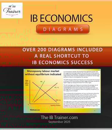
IB Economics Diagrams (2026): The Complete Exam-Ready Library for SL and HL
Diagrams are not optional in IB Economics - they are the difference between a 5 and a 7. Paper 1 and Paper 2 both reward students who can draw accurate, well-labelled economic models quickly and explain them clearly. Paper 3 may also contain diagrams. This resource gives you every diagram in the 2022-26 specification, with video walkthroughs, exam application guidance, and image-ready versions for your IA - all in one place, accessible on any device.


What Are IB Economics Diagrams - and Why are They Relevant?
IB Economics diagrams are visual economic models used to illustrate theoretical relationships between variables such as price, quantity, output, and welfare. In the IB Economics 2022-26 specification, accurate diagram use is an explicit assessment criterion across Paper 1, Paper 2, and Paper 3 (HL): examiners award marks specifically for correctly drawn, labelled and evaluated models, and deduct them when diagrams are absent, mislabelled, or inconsistent with the written argument.
The IB Economics syllabus contains approximately 90 core diagrams that all students - SL and HL - are expected to be able to draw and explain. HL students require additional advanced models, including consumer choice theory diagrams, more complex market power illustrations, and specialised macroeconomic models not assessed at SL. This resource covers 200+ distinct diagrams across all four modules, going beyond the minimum syllabus requirement to ensure you have all possibilities available before exam day.
Why Diagram Technique Decides Your Grade
Most IB Economics students know their theory. But few can draw the diagram that matches questions cleanly under exam pressure - labelled axes, correctly positioned curves, accurate shift arrows, and equilibrium points that match their written analysis. This gap between content knowledge and diagram execution is where marks are lost at every grade boundary.
Paper 1 part (a) questions - worth 10 marks - almost always require a diagram. Paper 2 data response questions reward diagram use even when not explicitly requested. In Paper 3 (HL), the ability to construct and interpret economic models under time pressure is the defining skill. The students who arrive at the exam having drawn each model repeatedly, not just recognised it on a page, are the ones who convert knowledge into marks.
What's Included in the IB Economics Diagrams Programme
• 200+ exam-ready diagrams covering the complete IB Economics 2022-26 syllabus - SL and HL
• Video walkthrough for every diagram, showing the correct model, labelling, and economic logic
• Image-ready versions formatted for direct use in essays, presentations, and your Internal Assessment
• Written theory explanation alongside each diagram, connecting the visual to the underlying economics
• Exam application guidance showing how to deploy each diagram effectively in Paper 1 and Paper 2 responses
• Organised by module and unit, following the exact structure of the 2022-26 specification
• Instant access on any device - laptop, tablet, or phone - work at your own pace without classroom pressure
One payment. One year access. No subscriptions, no hidden costs.
The complete IB Economics Diagrams Programme is available for a one-time payment of $24.49 USD. You get immediate 12-month access to all 200+ diagrams, every video walkthrough, all image-ready versions, and the full organised topic library - for the duration of your IB Economics course.
Complete Module-by-Module Diagram Coverage
Every diagram in the IB Economics 2022-26 specification is covered - no exceptions, no shortcuts. The library is organised to match your syllabus exactly, so you can work through modules in sequence or jump directly to the diagram type you need.
Introduction to Economics Graphs/Diagrams
Microeconomics Diagrams
Everything from basic supply and demand to complex market power models - with clear explanations and exam-focused applications.
Key diagram types:
Supply curves (individual and market)
Demand curves and shifts
Consumer and producer surplus
Price elasticity of demand and supply
Income and cross-price elasticity
Consumer choice theory (HL)
Externalities (positive and negative)
Market failure diagrams
Government intervention (price ceilings, price floors, taxes, subsidies)
Perfect competition models
Monopoly diagrams
Oligopoly and game theory
Related resources:
Macroeconomics Diagrams
Complete coverage of aggregate demand and supply, monetary policy, fiscal policy, and all macro models you'll need for IB Economics.
Key diagram types:
Aggregate Demand (AD) curves and shifts
Short-run Aggregate Supply (SRAS)
Long-run Aggregate Supply (LRAS) – both Keynesian and monetarist models
Inflationary and deflationary gaps
Phillips curves (short-run and long-run)
Money market diagrams
Investment diagrams
Keynesian multiplier models
Business cycle illustrations
Laffer curve
Related resources:
The Global Economy Diagrams
Everything from exchange rates and trade models to balance of payments - made clear through visual representations.
Key diagram types:
Comparative advantage models
Trade gains diagrams
Tariff effects
Quota impacts
Subsidy illustrations
Exchange rate determination (floating)
Fixed exchange rate systems
Balance of payments accounts
Marshall-Lerner condition diagrams
Related resources:
Balance of payments series
Development Economics Diagrams
Visual tools for understanding poverty, inequality, sustainable development and economic growth.
Key diagram types:
Stages of economic development
Human Development Index comparisons
Sustainability models
Foreign aid impacts
Related resources:
All HL extensions included - no exceptions, no shortcuts.
Why This Resource Is Different
Standard IB Economics textbooks include around 80 diagrams - enough to follow the text, not enough to prepare you for the full range of models an examiner can set.
Internet free resources are both inconsistent and unreliable, missing resources, incomplete copy-pasted materials, no direction offered to students.
YouTube tutorials are inconsistent in quality and rarely exam-specific.
This resource was built by an active IB Economics teacher who has seen the diagrams that lose students marks in real exam conditions, and designed every explanation around closing that gap. The result is a structured, 200+ diagram library where every model comes with the theory behind it, the video showing how to draw it, and the exam guidance on when and how to deploy it.
Frequently Asked Questions: IB Economics Diagrams
What diagrams do IB Economics students need to know?
The IB Economics 2022-26 syllabus requires approximately 90 core diagrams across all four units - microeconomics, macroeconomics, international economics, and development economics. HL students need additional advanced models not required at SL, including consumer choice theory, more complex market power diagrams, and specialised macroeconomic models. This resource covers 200+ diagrams to ensure complete preparation beyond the minimum syllabus requirement.
Do I need to draw diagrams in IB Economics exams?
Yes. Paper 1 and Paper 2 both reward accurate diagram use, and Paper 1 part (a) questions almost always require one explicitly. Even in questions that do not ask for a diagram directly, including a correctly drawn and labelled model demonstrates understanding and consistently earns additional marks. Paper 3 (HL) also requires students to construct and interpret economic models under timed conditions.
What makes a good IB Economics diagram?
A good IB Economics diagram has correctly labelled axes, accurately drawn and positioned curves, clearly marked equilibrium points, and shift arrows that match the argument in the written response. It should be drawn neatly enough to be unambiguous, and explained in the text - examiners expect the diagram and the written analysis to work together, not independently.
What is the difference between SL and HL diagrams in IB Economics?
Both SL and HL students use the same core diagrams across all four modules. HL students additionally require consumer choice theory diagrams, more advanced market power models, and certain specialised macroeconomic illustrations that are not assessed at SL. This resource covers all SL and HL diagrams, clearly labelled by level from beginning to end.
Can I use diagrams from this resource as model for my Internal Assessment?
Yes. The image-ready versions included in the programme are formatted for direct use in IA commentaries, essays, and presentations. The key requirement is that you understand each diagram thoroughly and can explain its application to your chosen article - examiners assess your ability to use the diagram analytically, not just to reproduce the correct image.
Related Content:
IB Economics Hub Page your IB Economics daily guide
IB Economics Activity book Page More IB Economics exam practice, activities, model answers and IB Economics Marking schemes
IB economics Calculations Book 25 units of IB Economics SL and HL calculations exercises, IB model answers, and IB marking schemes
IB Economics Microeconomics Hub Page, micro issues? go here
IB Economics Macroeconomics Hub Page, don't understand macro? start here
IB Economics Introduction to Economics Hub Page, stuck at the beginning of the course? Start here
IB Economics The Global Economy Hub Page, need to prepare the last module? This is the place for you
Read Next: IB Economics SL Hub Page


© Theibtrainer.com 2012-2026. All rights reserved.
Legal
Have a Tip? Send us a tip using our anonymous form
