
IB Economics Paper 2 May 2025
IB Economics May 2025 Paper 2 Analysis. A comprehensive guide to IB Economics Paper 2 Learn about how you could answer this paper properly and why.
IB ECONOMICS SLIB ECONOMICS HL
Lawrence Robert
4/14/202627 min read


IB Economics May 2025 Paper 2 Topic by Topic
Target Question:
What is the difference between GDP and GNI in IB Economics?
This is my personal analysis of every topic area tested in the IB Economics May 2025 Paper 2 - what the examiner was in my opinion really looking for, the content you need to master, and step-by-step instructions on how to structure a high-scoring response.
Lawrence's note 1: I don't reproduce IB copyrighted exam papers or materials, as this would be unauthorised use, reproduction, distribution, or display of copyrighted material, and therefore, would violate the exclusive rights of the IB Institution. I just make a summary from a teacher's point of view, of everything you actually need to prepare in order to be successful at a paper 1 similar to this one.
Same paper, both levels: Unlike Paper 1, IB Economics Paper 2 is identical for SL and HL students. The 40-mark paper, the 1h45 time allowance, the two questions, the calculator - there is no difference. This information is widely misreported online. Both levels answer one question from a choice of two.
Lawrence's Note 2:
What follows is not a set of predicted questions or a likely topics list. This would not be realistic and be wary of websites and sources that sell "predicted questions" for IB Economics. This is a topic-by-topic breakdown of what the IB Economics Board actually tested in May 2025, for paper 2 written to help my students understand the depth of knowledge required in each area of the IB Economics paper, and teach them how to approach this particular paper and papers similar to this one.
Unlike other exam boards, the IB rarely / never rewards memory reproduction / memorising alone.
Every topic here was examined in a way that required genuine economic reasoning, and that is what this page prepares you for IB Economics Evaluation + reasoning + Critical thinking.
IB Economics Paper 2 Quick Reference
Date May 2025
Time 1h 45 min
Marks 40
Questions Answer 1 of 2
Q1 country Kenya
Q2 country Bhutan
Calculator Yes
SL vs HL Same paper
How Paper 2 Works
Paper 2 is the data-response paper. You are given two substantial case studies - each built around three to five extracts and supporting statistical tables - and you answer one question in full. The question has seven parts: two definitions, a cluster of calculations and diagram sketches, four structured explanation questions each requiring a diagram, and a 15-mark extended response.
What was different about this Paper 2?
Q1 included a PES calculation - relatively uncommon in Paper 2. Q2 included three separate calculations in part (b), including a GNI calculation requiring knowledge of the GDP/GNI relationship. Q2(f) tested positive externalities of consumption - a less common externality type that many students confused with the production side.
Question Description
Part (a) is two definitions at 2 marks each - easy marks if you know your terminology.
Part (b) is a numerical calculation worth 2–3 marks plus a diagram sketch.
Parts (c) through (f) each ask you to use a specific diagram and explain something from the case study - 4 marks each.
Part (g) is the 15-mark essay where you integrate economic theory, diagrams, and references to the text.
Suggested Time Allocation
Definitions (a): 6 minutes | Calculations/diagrams/graphs (b): 8 minutes | Explain parts (c–f): 10 minutes each = 40 minutes | Essay (g): 45 minutes including planning. The 15-mark essay is worth 37.5% of the question - give it the time it deserves.
May 2025 Question 1
Kenya - Growth, Inequality, and Environmental Sustainability
Inflation - Food prices - PES - International trade - Exchange rates - Education - Income distribution
40 marks available
The Kenya case study is one of the most thematically rich in recent Paper 2 history. Kenya is achieving above 5% annual growth but facing severe climate shocks - droughts that halved food output, devastated employment for 40% of the population, and drove food-price inflation. The central bank responded with contractionary monetary policy. Meanwhile, the long-run picture is really positive: the HDI rose from 0.561 to 0.601, the Gini coefficient fell from 0.408 to 0.387, and 90% of electricity already comes from renewable energy. The 15-mark essay question on growth and environmental sustainability is therefore double-sided - Kenya's growth story has genuine green credentials, but also real environmental costs.
Question 1A - Definitions
(a)(i) Inflation [2 marks]
The context is food-price inflation in Kenya driven by drought-related supply shocks. The mark scheme rewards precision on two elements: the sustained nature of the increase and the focus on the general/average price level rather than a single price.
What the mark scheme credited:
1 mark (vague): The idea that it is an increase in prices.
2 marks (accurate): A sustained/persistent/continuous increase in the average or general price level.
The two words that cost students the second mark
Omitting "sustained" (or "persistent" or "continuous") and omitting "average/general." Writing "a rise in prices" scores 1 mark. Writing "a sustained rise in prices" scores 1 mark. Writing "a sustained rise in the average price level" scores 2 marks. Both qualifiers must be present. Note also that "sustained" is key - a one-off price increase is not inflation.
2-mark model answer
Inflation is a sustained increase in the general (average) price level in an economy over a period of time.
(a)(ii) Foreign aid [2 marks]
Foreign aid appears in the context of the Hustler Fund - a Kenyan government programme partly financed by foreign aid that provides low-interest loans to women, young people, and small firms for education and investment.
What the mark scheme credited:
1 mark (vague): The idea that it is assistance from overseas, or money given to poor countries or countries in need.
2 marks (accurate): That it flows from other countries or multilateral agencies to developing countries/ELDCs/countries in need AND that it involves a concessional transfer of resources OR consists of any two of the following: grants, low-interest/soft loans, technical support, humanitarian assistance, development support, debt relief.
Why "concessional" is relevant:
What makes foreign aid distinct from ordinary commercial lending or investment is that it is offered on terms more favourable than market rates - below-market interest rates, longer repayment periods, or outright grants. A definition that only says "money from one country to another" doesn't capture this and earns 1 mark. Mentioning any two of the forms (grants, soft loans, technical assistance, etc.) or the word "concessional" secures the second mark.
2-mark model answer:
Foreign aid is the concessional transfer of resources - including grants, soft loans, and technical assistance - from developed countries or multilateral agencies to developing countries or economies in need.
Master These topics at the IB Trainer:
IB Economics Inflation Hub Page
IB Economics Inequality Hub Page
Question 1(b) - PES Calculation, Revenue, and Diagram
This is one of the more demanding part (b) clusters in recent Paper 2 history. It involves three separate tasks: a PES calculation (uncommon in Paper 2), a total revenue calculation, and a demand-and-supply diagram sketch. The data comes from Table 1: Kenyan tea production 2021–2022.
Table 1 data
2021: Price = 324 KES/kg | Quantity = 3,700 million kg
2022: Price = 340 KES/kg | Quantity = 4,800 million kg
(b) (i) Price elasticity of supply for Kenyan tea, 2021 to 20222 marks
Full worked solution
PES = (% change in quantity supplied) ÷ (% change in price)
% change in Qs = (4,800 − 3,700) ÷ 3,700 × 100 = 1,100 ÷ 3,700 × 100 = 29.73%
% change in P = (340 − 324) ÷ 324 × 100 = 16 ÷ 324 × 100 = 4.94%
PES = 29.73 ÷ 4.94 = 6.02
Mark scheme notes:
1 mark: Any valid working - correct percentage change for either quantity or price (provided the formula is not inverted).
2 marks: Correct answer of 6.02 with valid working shown. An answer of 6.02 without working earns only 1 mark.
0 marks: The formula inverted (price change ÷ quantity change) earns 0 - this is explicitly stated in the mark scheme.
What PES = 6.02 tells us
A PES of 6.02 means supply is highly elastic - a 1% rise in price causes a 6% rise in quantity supplied. This is economically feasible for agricultural goods in a good harvest year: when prices rise, farmers bring more output to market. The fact that quantity rose by nearly 30% despite only a 5% price increase suggests factors beyond price were at work - but the calculation itself is straightforward.
The inverted formula - an expensive 2-mark error in Paper 2
Calculating % change in price ÷ % change in quantity (i.e., PED methodology applied to a PES question) earns zero marks - the mark scheme is unambiguous.
Always check: PES = (% ΔQs) ÷ (% ΔP), with Qs on top. If your answer is less than 1 for what appears to be a large quantity response to a small price change, revise and check for a formula inversion.
(b)(ii) Total revenue earned by Kenyan tea growers in 2022 (millions of KES)1 mark
Solution:
Total revenue = Price × Quantity
= 340 KES/kg × 4,800 million kg
= 1,632,000 million KES (= KES 1.632 trillion)
Mark scheme notes:
An answer of 1,632,000 (million KES), 1.63 trillion, 1,632 billion, or in scientific notation (1.63 × 10¹²) is sufficient for 1 mark. Working is not required for this part - but if you show it, make sure it is correct. The mark scheme accepts multiple equivalent expressions of the same value.
The Unit trap:
The question asks for the answer "in millions of KES." If you give 1,632,000 you are correct (that IS in millions). If you write 1,632,000,000,000 (the raw figure) without converting to millions you may confuse the examiner. The safest format: 1,632,000 million KES or KES 1.632 trillion.
(b)(iii) Demand and supply diagram: droughts caused food prices to rise in Kenya [2 marks]
Droughts reduced agricultural output - a supply-side shock. The diagram must show a leftward shift of the supply curve causing the price to rise. No demand shift is needed or appropriate here.
Diagram requirements:
Axes: Price on vertical axis (P acceptable), Quantity on horizontal axis (Q acceptable).
Curves: Downward-sloping demand curve (D). Two supply curves: S₁ (original, to the right) and S₂ (new, shifted left - smaller at every price - because droughts reduced output). The demand curve does not shift.
Prices: P₁ (original, lower equilibrium price) and P₂ (new, higher equilibrium price) shown with dotted lines from the intersection points to the price axis.
1 mark: Supply curve shifts left, but missing or incorrect labels. 2 marks: Fully labelled, supply shifts left, equilibrium price clearly rises from P₁ to P₂.
Do not shift the demand curve:
Some students shift demand rightward (reasoning that fewer food imports = higher domestic demand). The case study is clear: droughts reduced output → supply fell → price rose. The mechanism is supply-side. Shifting demand earns 0 marks for the diagram.
Question 1(c) - International Trade Diagram: Tariff Reduction on Rice
(c) How reducing the tariff on rice imports changes quantity demanded in Kenya [4 marks]
The context: droughts reduced domestic food output, so the Kenyan government cut the tariff on imported rice to increase food supply. The question focuses on the effect on quantity demanded of rice, not on who benefits from the tariff reduction.
Diagram requirements:
Axes: Price (vertical, P is sufficient), Quantity (horizontal, Q is sufficient).
Curves: Kenya's domestic supply (S, upward sloping) and demand (D, downward sloping). Two horizontal world price lines:
Sw + Tariff (or Pw + Tariff): the higher price before tariff reduction
Sw (or Pw, no tariff or reduced tariff): the lower price after reduction
Key movement: The Sw + Tariff line moves DOWN to Sw. At the lower price, domestic demand increases (move along the D curve) from Q₁ to Q₂. The quantity demanded arrow should clearly show this increase on the x-axis.
The mark scheme notes the increase in quantity demanded "can be shown in different ways" - a double-headed arrow on the x-axis, a bracket, or clear Q₁ and Q₂ labelling all work.
What the mark scheme credited for the explanation:
Reducing the tariff on rice lowers its price in Kenya's domestic market. At this lower price, the quantity demanded of rice increases (movement along the demand curve). The chain must be complete: tariff reduced → price falls → quantity demanded rises. Simply stating "more rice is imported" without connecting to the demand-side mechanism is incomplete.
Three world price lines - also accepted:
The mark scheme explicitly notes that a diagram with three horizontal lines (original Sw + full tariff, Sw + reduced tariff, Sw with no tariff) is also fully rewarded if the explanation is valid. This approach is useful if the tariff is only partially reduced rather than eliminated - which matches the case study language ("reduced the tariff").
Question 1(d) - Exchange Rate Diagram: Contractionary Monetary Policy and the KES
(d) How contractionary monetary policy could prevent depreciation of the KES [4 marks]
This question has a specific causal chain: higher interest rates → inward portfolio/financial investment → increased demand for KES → exchange rate rises (or is prevented from falling). The diagram must show demand for the KES shifting right.
Diagram requirements:
Axes: Vertical = price/value of the KES (shilling) in another currency (e.g., USD/KES or "other currency per shilling"). Horizontal = quantity of KES (or quantity of shilling).
Curves: Supply of KES (S, upward sloping - unchanged in the standard approach). Demand for KES shifts: D₁ to D₂ rightward.
Outcome: Exchange rate rises from e₁ to e₂ - the KES appreciates (or at minimum, the depreciation is prevented).
Causal chain in the explanation: Contractionary monetary policy → higher interest rates → foreigners invest in Kenya / save in Kenyan banks / buy Kenyan financial assets → they need KES to do so → demand for KES increases → KES appreciates (or depreciation is prevented).
Alternative approaches accepted by the mark scheme:
Supply shifts left: Higher interest rates reduce borrowing and therefore reduce imports (purchased with borrowed funds) and reduce outward portfolio investment. Less KES is sold → supply of KES shifts left → exchange rate rises. This is also fully rewarded if correctly explained.
Two-stage diagram: A diagram can show the supply of KES shifting right first (to illustrate the original depreciation pressure) then the demand curve shifting right to counter it and restore the original rate. If properly explained, this fuller approach earns full marks.
The most common error:
Drawing the supply of KES shifting right (which would cause depreciation, not appreciation). Contractionary monetary policy makes it less attractive to borrow KES and spend abroad - it does not increase the supply of KES in the forex market. Always ask: is this curve movement consistent with the economic mechanism/system being described?
Question 1(e) - Education, Human Capital, and Potential Output
(e) Effect of improved education on Kenya's potential output - AD/AS diagram [4 marks]
The data context is significant: secondary school attendance in Kenya rose from 13% in 2003 to 49% in 2022, with the Hustler Fund extending access further. Literacy is above 90%. These are supply-side improvements that increase the quality and quantity of human capital.
Diagram requirements:
Important mark scheme note: No AD or SRAS curve is required - only the LRAS curve is relevant here. The mark scheme explicitly states "no AD or SRAS required."
Axes: Price Level (vertical), Real GDP (horizontal).
Curves: LRAS₁ (original vertical line at Y₁) shifting rightward to LRAS₂ at Y₂. A Keynesian AS diagram is also fully accepted.
The shift: LRAS moves RIGHT because improved education increases the quality of labour (human capital), boosting productive capacity and shifting the economy's potential output from Y₁ to Y₂.
What the mark scheme credited in the explanation:
Increased education leads to an increase in efficiency, productivity, and/or an increase in the quantity or quality of labour, human capital, resources, or factors of production. This leads to an increase in the full employment level of output - potential output rises. The two-part structure (education → improved labour quality → LRAS shifts right) must be present for full marks on the written component.
Linking to the Hustler Fund:
The Hustler Fund is specifically mentioned as providing loans for education - a direct policy mechanism connecting foreign aid to human capital development. A brief reference to this in your explanation demonstrates case study engagement beyond simply including economic theory.
Question 1(f) - Lorenz Curve: Kenya's Income Distribution 2015–2022
(f) What happened to income distribution in Kenya between 2015 and 2022? [4 marks]
Table 3 shows Kenya's Gini coefficient fell from 0.408 in 2015 to 0.387 in 2022 - income distribution became more equal over this period. The Lorenz curve diagram must reflect this improvement.
Diagram requirements:
Axes: Vertical = Cumulative percentage of income (GDP and GNI are acceptable alternatives; "wealth" is NOT acceptable). Horizontal = Cumulative percentage of population or households.
Lines: Diagonal line of perfect equality (does not need to be labelled). Two Lorenz curves: 2015 (further from the diagonal - higher Gini, more unequal) and 2022 (closer to the diagonal - lower Gini, more equal). Both must be clearly labelled by year.
Key visual: The 2022 curve bows less severely away from the line of equality than the 2015 curve - reflecting the improvement from 0.408 to 0.387.
What the mark scheme credited in the explanation:
A lower Gini coefficient implies that income distribution became more equal between 2015 and 2022. The area between Kenya's Lorenz curve and the line of perfect equality is smaller in 2022 than in 2015. The explanation must connect the numerical change in the Gini to the graphical representation - just drawing two curves without stating what the Gini change means earns diagram marks only.
Context for the improvement:
While inequality fell, it remains relatively high (0.387 is still above many comparator economies). Moreover, Table 3 shows that 83% of employment remains in the informal sector - unchanged from 2015 - suggesting the inequality reduction may not reflect broad-based labour market improvements. A strong response notes both the improvement and its limitations.
Most common labelling error:
Writing "wealth" instead of "income" on the vertical axis - the mark scheme is explicit that wealth is not acceptable. Also, failing to label the two curves by year (or some equivalent distinction like "2015" and "2022") means the examiner cannot tell which curve represents which period - this risks losing all the diagram marks.
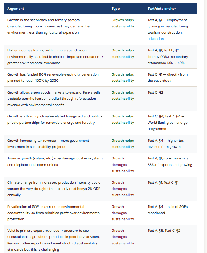
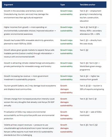
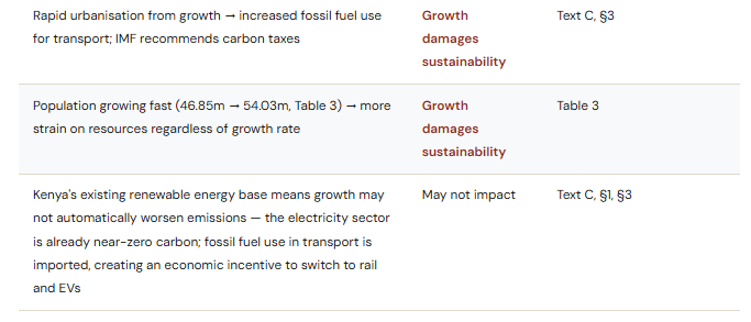
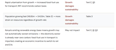
Question 1(g) - 15-mark Essay: Growth and Environmental Sustainability in Kenya
(g) Discuss the likely impact of high economic growth on environmental sustainability in Kenya [15 marks]
This is a "discuss" question requiring balanced analysis. The command term means you must present arguments both ways and reach a reasoned conclusion - not simply list ways growth damages the environment. The Kenya case study is well-designed for this question because it contains strong evidence on both sides: 90% renewable electricity and active reforestation programmes, but also rapid urbanisation, import-dependent fossil fuels, and volatile export agriculture under pressure from climate change.
The three-column structure from the mark scheme:
The mark scheme organises expected responses into three columns: growth improves sustainability / growth damages sustainability / growth may not impact sustainability (because policies are already in place). A top-band response engages with all three angles - not just the first two.
Mark band descriptors:
13–15 Thorough understanding. Fully explained theory. Relevant diagrams included and fully explained. Effective and balanced synthesis/evaluation. Text/data integrated to formulate a reasoned argument.
10–12 Specific demands understood. Theory explained. Diagrams included and explained. Mostly balanced evaluation. Text/data generally appropriate and correctly applied.
7–9 Understanding present but partially addressed. Theory partly explained. Some diagrams. Evaluation present but lacks balance. Some text/data use.
4–6 Some understanding. Theory described. Superficial evaluation. Limited text/data.
1–3 Little understanding. Irrelevant theory. No evaluation. No text/data.
The key arguments - mapped to the case study
Diagrams that strengthen this response:
The mark scheme suggests: an externalities diagram (to show negative externalities from carbon emissions/agricultural production), a PPC diagram (to illustrate the trade-off between growth and environmental sustainability), or an AD/AS diagram. Any diagram already drawn for parts (b)–(f) can be referred to in (g) and will be rewarded.
For top-band responses, a negative production externalities diagram with an explanation connecting it to, for example, expanding agricultural exports or urbanisation-related fossil fuel use is particularly effective.
Suggested conclusion structure:
The impact of growth on environmental sustainability in Kenya is not straightforward. Kenya's growth model is unusually green by developing-country standards - 90% renewable electricity, active carbon credit markets, and a government committed to climate-related investment. However, urbanisation pressures, agricultural export volatility, and the unsustainable pace of population growth all create genuine environmental risks. The balance depends on whether Kenya can maintain the supply-side and policy conditions that have kept its carbon footprint relatively low while managing the externalities of accelerating industrial and agricultural output. The conclusion should name one condition or policy that would determine the outcome - for example, the effectiveness of a carbon tax or the pace of the EV and rail transition.
Case 2 - Bhutan - Gross National Happiness and Economic Development Strategy
GNH - Hydropower - Youth unemployment - Fixed exchange rate - Positive externalities - Development strategy
40 marks available
Bhutan is a very distinctive case study. A lower-middle-income country measuring its economic development through Gross National Happiness rather than GDP, Bhutan has eliminated absolute poverty, achieved universal electricity access, reduced its Gini coefficient from 0.381 to 0.285 (a remarkable improvement), and seen its HDI rise steadily. But it faces a 20.9% youth unemployment rate, a growing current account deficit, 80% trade dependence on a single country (India), and significant agricultural constraints. The 15-mark essay - evaluating the strengths and limitations of the development strategy - is rich in material.
Question 2(a) - Definitions
(a)(i) Economic growth [2 marks]
The context is Bhutan's use of GNH as an alternative to GDP-centred growth measurement - the question therefore tests whether students can define economic growth precisely, which requires the "real GDP" element.
What the mark scheme credited:
1 mark (vague): The idea that a country's output increases.
2 marks (accurate): An increase in an economy's real GDP or total real output over time.
"Real" is essential:
Defining economic growth as "an increase in GDP" (nominal, not real) earns 1 mark - it misses the price adjustment that distinguishes genuine output growth from inflation-driven increases in nominal values. The word "real" (or "inflation-adjusted") must appear for the second mark.
2-mark model answer:
Economic growth is an increase in an economy's real GDP - the total value of goods and services produced, adjusted for inflation - over a given period of time.
(a)(ii) Resources [2 marks]
Appears in the context of the high cost of resources making government control of electricity production and distribution necessary. This is a basic IB Economics concept - factors of production.
What the mark scheme credited:
1 mark (vague): The idea that they are factors of production or inputs, OR goods/raw materials needed to produce output.
2 marks (accurate): Factors of production or inputs required to produce goods (and services) OR the idea that they are factors of production AND one example (land, labour, capital, entrepreneurship).
Easy second mark - name one factor:
The fastest route to 2 marks here: "Resources are the factors of production - land, labour, capital, and entrepreneurship - required to produce goods and services." Even "inputs such as land and capital required to produce goods and services" scores 2 marks. This is an easy definition to score all available marks.
Question 2(b) - Three Calculations: Real GDP, Nominal GDP per Capita, and GNI Change
This is the most calculation-intensive part (b) in the May 2025 paper - three separate numerical tasks, worth a total of 5 marks. The data comes from Table 4: Economic data for Bhutan 2008 and 2021.
Table 4 key data
2021: Nominal GDP = $2,539.55m | GDP deflator = 279 | Population = 782,455
2021: Net income from abroad = −$155.64m | Current account balance = −$321.53m
2008: Nominal GDP = $1,227.81m | Net income from abroad = −$34.02m
(b)(i)Bhutan's real GDP in USD in 20212 marks
Full worked solution:
Formula: Real GDP = (Nominal GDP ÷ GDP Deflator) × 100
Real GDP = ($2,539.55m ÷ 279) × 100
= $910.23 million (accept $910,232,974.91 or $910,232,975 or 9.1 × 10⁸)
Mark scheme notes:
1 mark: Any valid working shown - dividing nominal GDP by the deflator (even if multiplying by 100 is omitted, the working step earns the mark).
2 marks: Correct answer with valid working AND correct units. Without units, the second mark is at risk. The mark scheme accepts both the full value ($910,232,974.91) and rounded versions ($910.23 million).
Note the GDP deflator base year:
The GDP deflator for Bhutan has a base year that varies (as noted in the World Bank source). The deflator of 279 in 2021 means prices in 2021 were 2.79 times those of the base year. Dividing nominal GDP by 279 and multiplying by 100 correctly converts to real terms at base year prices. Some students forget the × 100 step - the mark scheme awards 1 mark even if this is omitted, provided the division is correct.
(b)(ii) Bhutan's nominal GDP per capita in USD in 2021 [1 mark]
Solution:
Nominal GDP per capita = Nominal GDP ÷ Population
= $2,539,550,000 ÷ 782,455
= $3,245.62
Mark scheme notes:
An answer of $3,245.62 or $3,246 is sufficient for 1 mark. Working is not required. Note this uses nominal GDP - do not use the real GDP figure from (b)(i). The OFR rule does not apply here because the own-figure from (b)(i) is real GDP, not nominal.
(b)(iii) Change in Bhutan's nominal GNI between 2008 and 2021 [2 marks]
This is the most conceptually demanding calculation in the May 2025 paper. It requires knowing that GNI = GDP + net income from abroad. The case study gives net income from abroad as a negative value in both years - Bhutan pays out more income to the rest of the world (largely loan interest to India) than it receives.
Full worked solution:
Formula: GNI = GDP + Net income from abroad
GNI 2021 = $2,539.55m + (−$155.64m) = $2,539.55m − $155.64m = $2,383.91m
GNI 2008 = $1,227.81m + (−$34.02m) = $1,227.81m − $34.02m = $1,193.79m
Change in GNI = $2,383.91m − $1,193.79m
= $1,190.12 million
Mark scheme notes:
1 mark: Any valid working - either the correct GNI for 2021 or the correct GNI for 2008 calculated and shown.
2 marks: Correct final answer of $1,190.12 million with valid working shown. An answer of $1,190.12m without any working earns 1 mark only.
Common errors:
Not knowing the GNI formula: Students who calculate real GDP per capita or percentage GDP change instead score 0. GNI = GDP + net income from abroad is a syllabus-standard formula.
Adding net income from abroad as a positive number: Both values in Table 4 are negative (−34.02 and −155.64), meaning Bhutan pays out more income to foreigners than it receives. Adding them as positive values produces GNI figures that are larger than GDP - which would be incorrect for a net debtor country.
Confusing this with the current account balance: The current account balance (also shown in Table 4) is not the same as net income from abroad - the current account includes trade in goods and services, income, and transfers. Net income from abroad is only the income component.
Question 2(c) - AD/AS Diagram: Electricity Exports and Bhutan's Real GDP
(c)Effect on Bhutan's real GDP of a large increase in electricity sales to India [4 marks]
Over 70% of Bhutan's electricity generation is exported to India. Revenues fund government spending on healthcare, education, and infrastructure. This question asks for the demand-side effect - increased exports increase aggregate demand.
Diagram requirements:
Standard approach - AD shifts right: Increased electricity sales to India = increased exports (X). Exports are a component of AD (C + I + G + X − M). Therefore AD increases → shifts right from AD₁ to AD₂. With an upward-sloping SRAS curve, price level rises from PL₁ to PL₂ and real GDP rises from Y₁ to Y₂.
Alternative approach - SRAS/LRAS shifts right: The mark scheme also accepts an explanation where the government uses electricity export revenues to fund infrastructure or education investment, leading to productivity improvements that shift SRAS or LRAS rightward. If this mechanism is correctly drawn and explained, it earns full marks.
Axes: Price Level (vertical), Real GDP (horizontal). Keynesian AS is permissible.
What the mark scheme credited in the explanation:
Increased electricity sales to India raise Bhutan's export revenues. Exports (X) are a component of AD. Higher X → AD increases → real GDP rises. The explanation must link sales → exports → AD component → GDP increase. Simply saying "GDP goes up" without the mechanism earns partial credit only.
Question 2(d) - Demand and Supply Diagram: Road Networks and the Price of Rice
(d) Effect of improved road networks on the price of rice sold in Bhutan's towns [4 marks]
The case study explains that most agricultural produce in Bhutan is consumed by farming households rather than sold in markets, partly because of inadequate infrastructure. The UN IFAD programme is investing in roads connecting farms to markets. Better roads reduce transport costs and increase the amount of rice that can reach urban markets.
Diagram requirements:
Axes: Price (vertical), Quantity (horizontal).
Curves: Demand curve (D, downward sloping - unchanged). Two supply curves: S₁ (original) and S₂ (shifted right/downward - greater supply at every price due to lower transport costs and better market access).
Outcome: Price falls from P₁ to P₂ as supply increases. Equilibrium quantity rises from Q₁ to Q₂.
The mechanism: Improved road networks → lower transport costs for rice farmers → reduced costs of supply → supply curve shifts right → equilibrium price falls in Bhutan's towns.
What the mark scheme credited in the explanation:
Improved road networks cause one of the following: a reduction in transport costs, or an increase in productivity or efficiency in getting rice to market. This increases the supply of rice available in Bhutan's towns, shifting the supply curve right and reducing the price of rice. Either mechanism (cost reduction OR efficiency gain) is sufficient - both are not required.
Context point worth mentioning:
Bhutan imports about 50% of its food (Text D, §6). Improved domestic road networks that bring more locally grown rice to market could reduce import dependence and improve food security - a development benefit beyond the price effect that would strengthen a full response in part (g).
Question 2(e) - Exchange Rate Diagram: Defending the Fixed BTN/INR Rate
(e) How Bhutan's central bank could maintain the fixed BTN/INR exchange rate during falling demand for Bhutanese metals and cement [4 marks]
This is a fixed exchange rate defence question - a more demanding variant of the standard exchange rate diagram. The ngultrum (BTN) is fixed to the Indian rupee (INR) at 1 BTN = 1 INR. If India's demand for Bhutanese metals and cement falls, the demand for BTN falls (India needs less BTN to buy Bhutanese exports), which would cause the BTN to depreciate - violating the fixed peg. The central bank must intervene.
Diagram requirements - standard approach:
Setup: The original equilibrium is at ER1 (the fixed rate, 1 BTN = 1 INR). Falling Indian demand for Bhutanese goods reduces demand for BTN → D₁ shifts left to D₂ → the exchange rate would fall to ER2 below the fixed rate.
Note from the mark scheme: Candidates do not need to draw the initial decrease in demand. The question asks only how the central bank could maintain the rate - the response can go directly to the central bank intervention.
The intervention: The central bank buys BTN using foreign exchange reserves (sells INR, buys BTN) → demand for BTN increases → D₂ shifts right back to D₁ → exchange rate returns to or is maintained at ER1.
Diagram: Show the demand curve shifting right (from D₂ or simply from D₁ with a rightward shift labeled as "central bank intervention"), with the exchange rate either rising or being maintained at ER1.
Three mechanisms accepted by the mark scheme:
The central bank can maintain the fixed rate by: (1) selling foreign currencies/assets from its reserves to buy BTN; (2) directly purchasing BTN in the forex market; or (3) raising the interest rate to attract capital inflows and increase demand for BTN. Any one of these, correctly drawn and explained, earns full marks.
Alternative approach (VAM): The mark scheme also accepts a leftward shift in the supply of BTN - the central bank restricts the supply of BTN through forex restrictions or capital outflow controls. If correctly drawn and explained, this earns full marks.
The practical context:
Bhutan's 80% trade dependence on India (Text F) makes this scenario highly plausible - any slowdown in Indian demand for Bhutanese exports directly threatens the fixed peg. The central bank's ability to defend the peg depends on the size of its foreign exchange reserves. A brief mention of this constraint in your explanation demonstrates engagement with the wider case study context.
Question 2(f) - Externalities Diagram: Education as a Positive Externality
(f) How increased government investment in education could achieve allocative efficiency in Bhutan's education market [4 marks]
This is a positive externality of consumption question - one of the less commonly drawn externality diagrams, which makes it a mark-differentiator. Education generates benefits to third parties beyond the private consumer (higher productivity, lower crime, better public health, stronger citizenship). The market therefore underproduces education relative to the socially optimal level.
Diagram requirements - positive externality of consumption:
Axes: Price (or Costs/Benefits) on vertical axis, Quantity on horizontal axis.
Curves:
MPC (= MSC = S₁): The supply/marginal private cost curve - upward sloping. In this externality type, there is no divergence between MPC and MSC (the external benefit is on the consumption/demand side, not the production side).
MPB (= D): Marginal private benefit = the private demand curve, downward sloping. This reflects only what individuals are willing to pay.
MSB: Marginal social benefit - above MPB at every quantity, because education generates positive spill overs to society beyond the private benefit.
Market equilibrium: Where MPC = MPB → quantity QS (subscript S for "sub-optimal market output").
Social optimum: Where MSC = MSB → quantity QO (to the right of QS).
Welfare loss: The triangle between MSB and MSC from QS to QO - representing the under allocation of resources to education.
Government investment effect: Two acceptable approaches:
Supply curve shift: Government investment increases the number of educational institutions → MPC shifts down/right to MPC2 → new equilibrium moves toward QO.
Demand curve shift: Government measures encourage more participation in education → MPB shifts right toward MSB → new equilibrium closer to QO.
If the question is interpreted as "achieving" (rather than merely "improving") allocative efficiency, both the social optimum output AND the new post-intervention output must be clearly shown.
The most important marking factor in this paper:
The mark scheme allows for a positive production externality diagram (MSB = MPB, MSC below MPC) if the explanation is otherwise correct - but it explicitly notes that if you draw the wrong type of externality diagram, you are capped at 1 mark for the diagram component (not 2). You can still earn up to 2 marks for the written explanation independently. So: drawing a positive consumption externality correctly earns up to 2 diagram marks. Drawing a positive production externality earns 1 diagram mark - but the explanation can still earn 2 marks if it explains the mechanism correctly.
The correct externality type here is positive externality of consumption - the benefit externality is on the demand side (people consuming education generate spill over benefits for others), not the supply side.
What the mark scheme credited in the explanation:
Government investment in education increases supply (more institutions) OR encourages greater participation (demand shifts). This results in at least one of the following: more resources being allocated to education; the removal or reduction of the welfare loss; a new equilibrium where MSB = MSC; or output moving to or closer to the social optimum level. The chain from government investment → market correction → allocative efficiency (or improvement) must be present.
Question 2(g) - 15-mark Essay: Evaluating Bhutan's Development Strategy
(g) Evaluate the strengths and limitations of Bhutan's economic development strategy [15 marks]
This is an "evaluate" question - requiring an appraisal by weighing up strengths and limitations with a clear conclusion and supporting evidence. The GNH framework gives this case study an unusual richness: Bhutan's development strategy is genuinely distinctive, and the strengths and limitations are both well-supported by the case study data. The table below maps the key strategies with their arguments from the mark scheme.
Mark band descriptors:
13–15 Thorough understanding. Fully explained theory. Relevant diagrams included and fully explained. Effective, balanced evaluation of strengths and limitations. Text/data integrated throughout.
10–12 Theory explained. Diagrams included and explained. Mostly balanced. Text/data generally correct and applied.
7–9 Theory partly explained. Some diagrams. Evaluation present but unbalanced. Some text/data.
4–6 Theory described. Superficial evaluation. Limited text/data.
1–3 Little understanding. Irrelevant theory. No evaluation. No text/data.
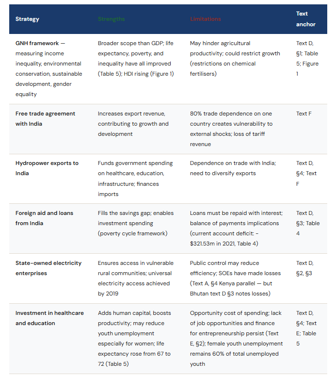
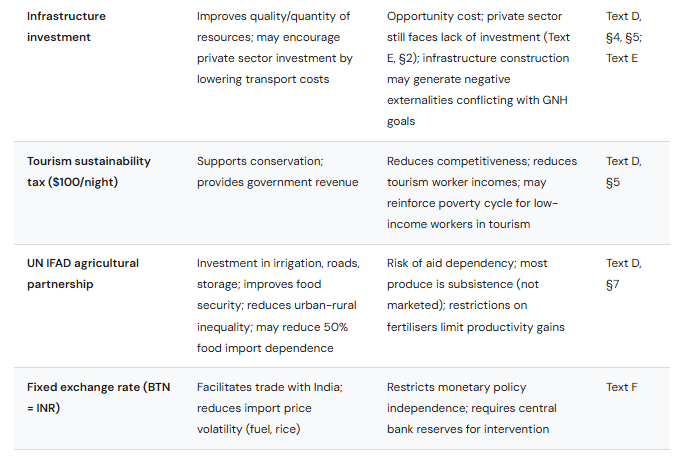
Strategy-by-strategy evaluation - from the mark scheme
Which strategies to choose for a high-scoring response:
The mark scheme states candidates are not expected to cover every strategy. Two or three well-developed strategies with thorough evaluation outperform a shallow survey of all ten. The strongest combinations from an evaluation standpoint are:
Hydropower + India trade dependence: A clear strength (revenue funds development) with a clear structural vulnerability (80% trade concentration)
Education and healthcare investment + youth unemployment: Investment shows genuine results (life expectancy, HDI, poverty elimination) but youth unemployment at 20.9% with 60% female skew suggests the strategy is not reaching its target population effectively
GNH framework overall: A high-level evaluation of whether measuring happiness rather than GDP produces better development outcomes - the data is broadly positive but with clear gaps
Diagrams that strengthen this response:
Diagrams already drawn in parts (c)–(f) can be referenced and will be rewarded. New diagrams that add value:
Poverty cycle diagram: Shows how investment in education and healthcare breaks the cycle - directly relevant to the Hustler Fund / IFAD partnership discussion
Lorenz curve: Bhutan's Gini fell from 0.381 to 0.285 - one of the most dramatic inequality reductions in the data. A Lorenz curve showing this would be a strong visual anchor
Externalities diagram: The positive externality of education already drawn in (f) can be referred to here in the context of human capital investment
AD/AS diagram: Already drawn in (c) - can be referenced when discussing the GDP impact of electricity export revenues
Suggested conclusion structure for 13–15 marks:
Bhutan's development strategy has produced measurable successes: absolute poverty eliminated, Gini coefficient reduced from 0.381 to 0.285, life expectancy up five years, and universal electricity access achieved. The GNH framework has kept the strategy anchored to equity and sustainability rather than economic growth alone - a genuine strength. However, three structural limitations undermine the strategy's long-run resilience: 80% dependence on a single trade partner (India) creates external vulnerability; a 20.9% youth unemployment rate (disproportionately female) suggests the human capital investment has not yet translated into private sector job creation; and the current account deficit (−$321.53m in 2021) is widening as loan repayments grow. The strategy is stronger on social outcomes than on the economic dynamism needed to sustain them. Whether this constitutes success depends on how one weights wellbeing relative to growth - which is precisely what the GNH framework was designed to ask.
A Quick Look At The Exam
Paper: Paper 2
Date: May 2025
Duration: 1h 45m
Total marks: 40
Structure: Choose 1 question out of 2
Part (1) 40 marks
Part (2) 40 marks
Frequently asked questions - May 2025 Paper 2
The questions students ask most often about this paper - answered directly.
What made the May 2025 Paper 2 harder than average?
Question 2 (Bhutan) included three separate numerical calculations in part (b), one of which required knowledge of the GDP-GNI relationship (GNI = GDP + net income from abroad). This is syllabus content but appeared in a calculation context rather than a definition, catching many students off-guard. Question 2(f) tested a positive externality of consumption diagram - less commonly drawn than the negative production externality - and the mark scheme distinguished between positive consumption (correct) and positive production (penalised by 1 diagram mark). Question 1 included a PES calculation, which is uncommon in Paper 2.
What is the difference between GNI and GDP, and why is it relevant for the Bhutan question?
GDP measures the total value of goods and services produced within a country's borders. GNI (Gross National Income) adds net income from abroad - wages, dividends, and interest received from or paid to the rest of the world. For Bhutan, net income from abroad was negative in both 2008 (−$34.02m) and 2021 (−$155.64m), reflecting interest payments on Indian loans for hydropower infrastructure. So GNI is smaller than GDP for Bhutan, and the gap is widening. This is relevant for development analysis: while GDP is growing, the income that actually stays in Bhutan is smaller and shrinking relative to GDP.
How do you draw a positive externality of consumption diagram for education?
In a positive externality of consumption, the external benefit is on the demand side. Draw: MPC (= MSC = supply curve), MPB (the private demand curve), and MSB (the marginal social benefit curve, which sits above MPB because education benefits society beyond what individuals pay for). The market equilibrium is where MPC = MPB, producing Q-sub-S (sub-optimal). The social optimum is where MSC = MSB, at Q-sub-O (greater than Q-sub-S). The welfare loss triangle lies between MSB and MPC from Q-sub-S to Q-sub-O. Government investment shifts either MPC rightward/downward (more supply) or MPB rightward (more participation) toward the social optimum.
What is Gross National Happiness and is it relevant as an economics concept?
Gross National Happiness (GNH) is Bhutan's official development framework, adopted in 2008 as an alternative to GDP-centred measurement. It considers income inequality, environmental conservation, sustainable development, and gender equality alongside the standard components of the Human Development Index. In IB Economics, it is relevant as an example of an alternative indicator of economic development - alongside HDI, the Gini coefficient, and other composite measures. The mark scheme for the May 2025 essay treats GNH as a strength of Bhutan's development strategy (broader scope, better alignment with wellbeing) while also identifying it as a potential limitation (may restrict agricultural productivity through environmental constraints).
How should I decide between the Kenya and Bhutan questions in May 2025?
The Kenya essay (Q1g) asks you to discuss the impact of growth on environmental sustainability - a classic economic growth vs environment trade-off with a genuinely balanced case study. The Bhutan essay (Q2g) asks you to evaluate the strengths and limitations of a development strategy - requiring depth on multiple policy areas. If you are confident on externalities, income distribution, and development theory, Bhutan rewards breadth. If you prefer environmental economics and growth frameworks, Kenya is the stronger choice. The pivotal calculation check: Q2 has three numerical tasks in part (b) including the GNI formula - if you are not sure about applying this formula, Kenya's PES calculation is more straightforward.
Stay well,
Read More About:
IB Economics Hub Page your IB Economics daily guide
IB Economics Diagrams Page Check this resource for All the IB Economics syllabus diagrams with explanations
IB Economics Activity book Page More IB Economics exam practice, activities, model answers and IB Economics Marking schemes
IB economics Calculations Book 25 units of IB Economics SL and HL calculations exercises, IB model answers, and IB marking schemes
Read Next: IB Economics Exam Paper 2 November 2025
© Theibtrainer.com 2012-2026. All rights reserved.
Legal
Have a Tip? Send us a tip using our anonymous form