
IB Economics Beyond GDP Measuring Happiness
Discover how economists measure well-being through alternatives to GDP such as happiness, sustainability, and quality of life. IB Economics student guide.
IB ECONOMICSIB ECONOMICS MACROECONOMICS
Lawrence Robert
4/22/202514 min read


Is Your Country Actually Doing Well? The Business Cycle, GDP's Shortcomings, and Why Finland Keeps Winning at Life
Target Question:
"What is the business cycle in economics and why GDP may not a good measure of well-being?"
This is a real story from late 2023. Sarah runs a small café in Manchester. She's been watching the news every evening, and it's not exactly happy news. Energy bills have doubled. Fewer customers are coming through the door. Two of her suppliers have gone bust. She keeps hearing the word "recession" on the BBC. But the government insists the economy is "fundamentally strong." Sarah isn't convinced.
Sarah's story isn't unusual. In fact, it's a pretty perfect illustration of what economists call the business cycle - the idea that economies don't grow in a smooth, straight line. They go up, come down, hit a wall, and (eventually) bounce back. Like a really stressful rollercoaster that never ends.
Once you understand the business cycle, a second question springs to mind: what do we mean when we say that an economy is "doing well"? Is it all about GDP numbers? Or is there something - that the numbers and the statistics are missing?
The Business Cycle: Life is Full of Ups and Downs (Especially for Economists)
Let's start with the basics. The business cycle (sometimes called the trade cycle) is a model that describes the fluctuations of economic activity in a country over time. Think of it like a heartbeat monitor - you want the line to trend upward overall, but there are always peaks and troughs along the way.
The key measure here is real GDP - the total value of goods and services produced in an economy, adjusted for inflation. When real GDP is rising, things are generally going well: more is being produced, more people are in work, and businesses are confident. When real GDP falls, the picture is not so nice.
What makes the business cycle useful as a model is that it separates two things:
Short-term fluctuations - the bumps and dips that reflect what's happening right now in the economy
Long-term growth trend (potential output) - the underlying upward trajectory that shows where the economy could be if it was firing on all cylinders
IB Economics Key Definition - Potential Output: Potential output represents the maximum sustainable level of real GDP over the long term. It's shown as the upward-sloping trend line in a business cycle diagram. Basically the economy's "ceiling" and what it can produce consistently without overheating.
Economic growth happens when real GDP rises for two consecutive quarters. Two quarters in a row - that's six months of growth. When that happens, unemployment tends to fall, consumer confidence rises, and the economy generally feels like it's going somewhere good. Economic growth is usually a positive thing: it implies higher earnings, more jobs, and overall a more prosperous economy.
The Five Stages of the Business Cycle
Every good TV series has its seasons. The business cycle has five. Let's walk through them with Sarah's café as our guide.
1. Peak (or Boom)
The good times. Economic activity is at its highest point. Unemployment is low. Business owners like Sarah are turning a profit, hiring more staff, and maybe even thinking about opening a second branch. Consumer confidence is high - people are spending freely. On the macroeconomics level, investment, government spending, consumption and exports are all at their highest point.
IB Economics real-life example: UK in early 2022, post-lockdown euphoria. People were back out spending after two years stuck at home. Restaurants were packed. Holidays were booked. The economy was roaring.
"At the peak, everyone's a genius - businesses are making money, consumers are spending, and politicians are taking credit." - This is basically what you can read in every macroeconomics textbook.
2. Recession
Here's the technical definition your IB Economics examiner wants to see: a recession is a fall in real GDP for two consecutive quarters. Two quarters. Six months. Back to back. That's the rule. Not one bad month, not a rough patch - two solid quarters of the economy shrinking.
IB Economics real-life example UK 2023: The UK entered a technical recession at the end of 2023. Real GDP contracted by 0.1% in Q3 and then by 0.3% in Q4. For Sarah's café, this meant fewer customers, tighter margins, and insecurity about the months ahead. Business failures increased, job losses mounted, and consumer confidence nosedived. The causes? A perfect storm: the lingering effects of the COVID-19 pandemic, sky-high energy costs, and the Bank of England raising interest rates aggressively to fight inflation.
Recessions cause real harm. Businesses fail. People lose jobs. Households cut spending because they're scared about what's next. That uncertainty spreads - it becomes a self-fulfilling prophecy. When everyone stops spending because they're worried, the economy actually does get worse. It doesn't surprise anyone.
3. Trough (or Slump)
The trough is the bottom of the cycle - an economic valley of despair. Real GDP growth is negative. Consumption is at a low point. Investment has dried up. Net exports are sluggish. Businesses are closing. Unemployment is rising sharply, sometimes called "mass unemployment." It's basically the economy at its lowest point.
Think of the global economy in early 2009, after the financial crisis. Banks were collapsing. Unemployment was surging. Entire industries were in freefall. Or March 2020 - COVID-19 hit, and when the economy essentially came to a halt overnight.
4. Recovery
Eventually, things start to turn around. After the trough, real GDP begins to rise again. Gradually, consumption picks up. Investment starts to return. Exports improve. New jobs are created. Consumer and business confidence tentatively recovers - people start spending a little more, businesses start hiring again.
IB Economics real-life example UK Q1 2024: The UK's recovery arrived faster than many expected. By Q1 2024, real GDP had grown by 0.6% - beating economists' forecasts of 0.4%. The services sector - which is huge for the UK economy - grew for the first time in nearly a year. Sarah's café started getting busier again. Not back to normal yet. But heading in that direction.
5. Expansion
Expansion is what happens when the recovery really gets going - when the level of economic activity surpasses its previous peak. Investment keeps rising. Consumption grows strongly. Government spending plays its part. Export earnings climb. This continuous growth actually increases the economy's potential output - the ceiling rises. New businesses open, technology improves, productivity increases. This is the economy at its best.
IB Economics Key Point - External Shocks: The business cycle doesn't always follow a smooth pattern. External shocks - events outside the normal flow of the economy - can violently disrupt the trend line. Examples include natural disasters, global financial crises (2008), geopolitical conflicts, and of course the 2019 coronavirus pandemic, which caused the most sudden economic contraction in modern history. These shocks can plunge an economy from boom to trough almost overnight.
Every episode of Pint-Sized links back to what matters most for your IB Economics course:
Understanding key IB Economics concepts
Applying them in real-world IB Economics contexts
Building IB Economics course confidence without drowning in dry theory.
Subscribe for free to exclusive episodes designed to boost your IB Economics grades and confidence
So If GDP Tells Us So Much, Why Can Economic Times Still Be Miserable?
The business cycle is built around GDP - gross domestic product, the total value of goods and services produced in a country. And when economists and policymakers want to compare economic well-being across time or between countries, they reach for GDP and GNI statistics (Gross National Income - which also includes income earned abroad by a country's residents).
Higher real GDP per capita generally means better living standards, right? More stuff produced means more stuff consumed. It makes sense.
But this is the problem: GDP is a bit like measuring your health by only counting how many steps you walk. Steps matter, sure. But what about your sleep? You emotional well-being? Your stress levels? Whether you're eating junk food? Whether you have friends? The picture is way more complex than one single number.
National income statistics have some serious limitations when it comes to measuring actual living standards and human well-being. And your IB Economics examiner wants you to know all of them.
The Limitations of GDP and GNI
1. They ignore inequality. GDP tells you how big the economic pie is. It doesn't tell you who's eating it. A country can have enormous GDP while a small elite hoards most of the wealth and millions live in poverty. Saudi Arabia, for instance, has very high GDP per capita - but extreme income inequality means that wealth is distributed very unevenly. The statistics are the same whether everyone gets a slice or just a few people get the whole cake.
2. They ignore differences in the cost of living. Even with PPP adjustments, the data misses things like the absurd cost of housing in cities like London, San Francisco, or Sydney. Someone earning £35,000 in central London is effectively poorer than someone earning the same salary in a rural area - but GDP per capita doesn't capture that.
3. Exchange rate fluctuations distort international comparisons. When currencies strengthen or weaken dramatically, GDP comparisons between countries can become almost meaningless over time. A country's GDP in dollar terms can change massively only because its currency moved - even if nothing changed in the real economy of that country.
4. The shadow economy is invisible. In some countries, a huge proportion of economic activity happens off the books - informal markets, cash-in-hand work, barter economies. In parts of sub-Saharan Africa and South Asia, the informal economy can represent 30–50% of actual economic activity. None of that shows up in official GDP figures, making international comparisons unreliable.
5. Growth often comes at an environmental cost. Economic growth can mean more pollution, deforestation, and carbon emissions. A country that chops down all its forests to sell timber will see a GDP spike - and then be left with environmental devastation that doesn't appear anywhere in the national accounts. This is a massive limitation in the 21st century, as climate change reshapes everything.
6. Social welfare benefits vary hugely between countries. Scandinavia has enormous welfare states collected from high taxes - free healthcare, free university, generous unemployment support. The US has comparatively minimal public provision. But both countries' GDP figures don't tell you this. Two people with identical incomes can have wildly different real standards of living depending on what the state provides for free.
7. The composition of output matters. What if a significant chunk of a country's GDP comes from military spending and arms production? That boosts the number - but it doesn't necessarily improve the average person's quality of life one bit. A country spending heavily on weapons and very little on healthcare could have a high GDP and a miserable population.
8. Tax rates aren't shown. Two countries with the same GDP per capita but radically different tax systems will deliver very different after-tax living standards. GDP statistics don't show you this.
IB Economics Key Point: Economic growth often comes at the opportunity cost of greater inequalities in income and wealth, and/or environmental damage - neither of which is captured in GDP or GNI statistics. This is a key AO3 evaluation point for your IB Economics essays.
Economists Often Try to Measure the Unmeasurable
So if GDP is so flawed, what do we do instead? Over the past few decades, a bunch of alternative measures have been developed - each trying to capture a richer picture of human well-being.
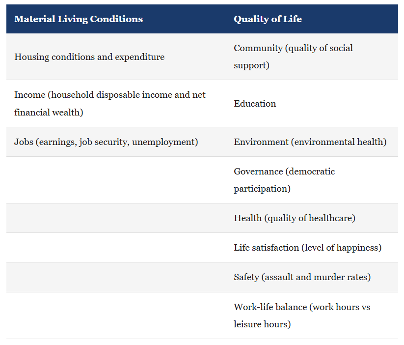
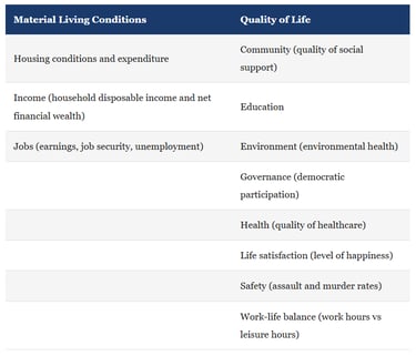
1. The OECD Better Life Index (BLI)
In May 2011, the OECD - the Organisation for Economic Co-operation and Development, a club of mostly wealthy nations - launched its Better Life Index. The idea was straightforward: rather than just measuring economic output, why not measure the actual factors that make life good?
The BLI tracks 11 indicators, split across material living conditions and quality of life:
For access to all IB Economics exam practice questions, model answers, IB Economics complete diagrams together with full explanations, and detailed assessment criteria, explore the Complete IB Economics Course
One clever feature of the BLI is that users can customise the weighting of each indicator based on what they personally value. Does work-life balance matters more than income to you? You can say so. It's like a personalised happiness dashboard.
The drawback? Because the BLI doesn't produce a single ranked list (the 11 indicators aren't combined into one score), it's difficult to make clean comparisons between countries. Norway might beat you on life satisfaction but rank lower on work-life balance. How do you weigh that up?
2. The World Happiness Report (Happiness Index)
In April 2012, the United Nations got in on the act. The World Happiness Report - published annually by the UN's Sustainable Development Solutions Network - ranks countries by how happy their citizens report they are. It's exactly as Nordic-dominated as you'd expect.
The methodology is simple. A representative sample of people in each country is asked to imagine a ladder, with 0 at the bottom (worst possible life) and 10 at the top (best possible life), and asked to say where they currently stand. Simple question.
IB Economics real-life example World Happiness Report 2025: For the eighth year in a row, Finland topped the rankings with a score of 7.736/10. Denmark, Iceland and Sweden followed close behind. The Nordic countries consistently dominate, driven by extensive social welfare programmes, low corruption, strong community ties, and a cultural emphasis on balance rather than hustle. Meanwhile, the United States fell to its lowest-ever ranking at 24th - and the UK wasn't far behind at 23rd. France dropped to 33rd. The 2025 report focused on the theme of "caring and sharing," finding that people consistently underestimate others' kindness - and that correcting this pessimism actually makes people happier. Costa Rica achieved the highest-ever ranking for a Latin American country, coming in at 6th.
The broader 14-indicator framework underlying the Happiness Index covers everything from business and economic factors to religion, technology, transportation, and emotional well-being. The index is designed to adapt over time - recognising that what makes people happy isn't static. The 2025 edition, for example, explored the impact of social media on young people's happiness (and it wasn't great).
The limitation here? Comparing happiness scores across time is rather difficult because the index adapts. If the goalposts shift, did the score really improve - or did the question change?
Every episode of Pint-Sized links back to what matters most for your IB Economics course:
Understanding key IB Economics concepts
Applying them in real-world IB Economics contexts
Building IB Economics course confidence without drowning in dry theory.
Subscribe for free to exclusive episodes designed to boost your IB Economics grades and confidence
3. The Happy Planet Index (HPI) - The One That Tells Rich Countries to Sort Themselves Out
This is possibly the most thought-provoking of the lot. Introduced by the New Economics Foundation in 2006, the Happy Planet Index doesn't just ask "are people happy?" - it asks: "are people happy, and is the planet paying for it?"
The formula is:
HPI Formula:
HPI = (Well-being × Life Expectancy × Inequality of Outcomes) ÷ Ecological Footprint
Countries that deliver long, happy, equal lives with a small environmental footprint score highly. Countries that burn through resources to generate modest well-being score poorly. It reframes the entire definition of "success."
The four components are:
Well-being - how residents rate their lives on a 0–10 scale (Gallup World Poll data)
Life expectancy - the average number of years a person is expected to live (UN data)
Inequality of outcomes - how equally distributed life expectancy and happiness are within the country
Ecological footprint - the average person's environmental impact (Global Footprint Network data)
IB Economics real-life example Happy Planet Index 2024: And the winner is... Vanuatu. A Pacific island nation you might need to Google. Vanuatu achieves a life expectancy of 70.4 years and a wellbeing score of 7.1 out of 10 - all with a carbon footprint well below the globally fair share of 3.17 tonnes CO₂ per capita. The top five were Vanuatu, Sweden, El Salvador, Costa Rica, and Nicaragua. The USA? 102nd. The UK? 19th. The 2024 HPI also found that within countries, the wealthiest 10% have carbon footprints dramatically higher than everyone else - but their wellbeing outcomes are only marginally better. Translation: being super rich doesn't make you proportionally happier, but it does trash the planet more efficiently.
The HPI makes a powerful argument: high-income countries consistently underperform. They may have sky-high GDPs, but their enormous ecological footprints drag their scores down. Small, lower-income countries - particularly in Central America and the Pacific - punch far above their weight because their people live well without burning through the planet's resources to do it.
Critics, however, point out that the HPI can paint an unrealistically rosy picture. Some countries score highly on the index despite serious human rights abuses, political repression, or poor governance. Well-being surveys in authoritarian states may not reflect genuine freedom or satisfaction. A high score doesn't mean everything is fine - just that the four variables happen to align favourably.
So… Can We Measure Well-being Properly?
To be honest none of these tools individually, measures well-being properly. Each index captures something real and important, but each also has blind spots. The BLI gives you significant differences between countries but no ranking. The Happiness Report gives you rankings but struggles with historical comparisons. The HPI gives you environmental accountability but might miss human rights issues completely.
What all three agree on - and what your IB Economics examiners are looking for you to articulate - is that GDP alone is a deeply inadequate measure of human well-being. It tells you how much is being produced. It tells you nothing about inequality, sustainability, mental health, social cohesion, work-life balance, or whether people are actually happy.
Finland has proven this. It doesn't have the world's highest GDP. But it has remarkable social trust, low corruption, world-class public services, and a culture that genuinely values balance. The Finns have figured out something that most high-GDP countries haven't: money is the means, not the end. But let's also remember, that Finland is a country with a population of hardly 5.7 million people where the sense of community can be easily developed, and where resources can be shared among all its inhabitants.
As for Sarah's café in Manchester? By mid-2024, she was doing better. Customers were coming back. The economy had technically exited recession. But her energy bills were still higher than pre-2022, her staff costs had risen, and she'd had to put up her prices. GDP said "recovery." Sarah's lived experience said "life is not so simple."
Which is precisely why these alternative measures matter. Real people live in the gap between the GDP headline and the actual experience of daily life. The job of economics - and of good economic measurement - is to close that gap.
IB Economics Diagrams Programme, What's included:
200+ exam-ready diagrams covering the entire IB Economics syllabus
Video for every diagram showing you exactly how each model looks
Image version perfect for modelling diagrams in you essays, presentations, and your IA
Detailed written explanations of the IB Economics theory behind each diagram
Both SL and HL IB Economics diagrams clearly labelled and organised by topic
Real IB Economics exam application showing how to use diagrams effectively in Paper 1 and Paper 2
Frequently Asked Questions
What is the business cycle in economics?
The business cycle (also called the trade cycle) is a model describing the recurring fluctuations in economic activity over time. It has five stages: peak (boom), recession, trough (slump), recovery, and expansion. The cycle is measured using real GDP and shows how economies move between periods of growth and contraction around a long-term upward trend known as potential output.
What is the technical definition of a recession?
A recession is a fall in real GDP for two consecutive quarters (i.e., six months). During a recession, unemployment rises, business and consumer confidence falls, investment slows, and economic output shrinks. The UK experienced a technical recession in the second half of 2023, with GDP contracting in both Q3 and Q4.
Why is GDP not a good measure of economic well-being?
GDP measures the total value of goods and services produced, but it ignores income inequality, environmental damage, informal economic activity, differences in cost of living, the composition of output, and social welfare provision. A country with high GDP may still have widespread poverty, environmental destruction, or low happiness - none of which appears in the GDP figure.
What are the main alternatives to GDP for measuring well-being?
The three main alternatives used in IB Economics are: the OECD Better Life Index (BLI), which tracks 11 indicators including housing, health, and work-life balance; the World Happiness Report (Happiness Index), which ranks countries based on self-reported life satisfaction on a 0–10 scale; and the Happy Planet Index (HPI), which measures well-being per unit of ecological footprint using the formula: (Well-being × Life Expectancy × Inequality of Outcomes) ÷ Ecological Footprint.
Why does Finland top the World Happiness Report every year?
Finland has been ranked the world's happiest country for eight consecutive years (as of the 2025 report). Economists attribute this to strong social welfare systems, low corruption, high levels of social trust, quality public services, and a cultural emphasis on work-life balance rather than relentless productivity. Interestingly, its relatively high GDP is not the primary driver - it's the quality of social relationships and institutions that stands out.
Stay well,
Explore Topics:
IB Economics Calculations Book Access Unit 15 for practicing the GDP deflator formula and Real GDP calculations
IB Economics Macroeconomics Hub Page
Aggregate demand Page and Aggregate Supply Page for exploring the AD/AS model
IB Economics Activity book access unit 3.2 to practice measuring economic activity, 3.3 for calculating GDP and 3.4 for the business cycle exam questions and activities together with model answers and IB marking schemes.
Read Next: IB Economics Inequality Equality and Equity
© Theibtrainer.com 2012-2026. All rights reserved.
Legal
Have a Tip? Send us a tip using our anonymous form